Skip to content
github-actions[bot] edited this page Sep 13, 2026 · 4 revisions

Human Interface Guidelines

The HIG contains guidance and best practices that can help you design a great experience for any Apple platform.

Design fundamentals

Explore the principles that guide design across Apple platforms. For more, see Getting started.

A stylized representation of a building block. The image is tinted green to subtly reflect the green in the original six-color Apple logo.
Design principles
Explore fundamental principles that guide design across Apple platforms.

A stylized representation of an iPhone Duo frame. The image is tinted green to subtly reflect the green in the original six-color Apple logo.
Designing for iPhone Duo
An app designed for iPhone Duo adapts seamlessly to both displays, providing a continuous experience as the device opens and closes.

A stylized representation of an iPhone frame. The image is tinted green to subtly reflect the green in the original six-color Apple logo.
Designing for iOS
People depend on their iPhone to help them stay connected, play games, view media, accomplish tasks, and track personal data in any location and while on the go.

Foundations of design

Discover key concepts that shape every great experience. For more, see Foundations.

A sketch of the Accessibility icon. The image is tinted yellow to subtly reflect the yellow in the original six-color Apple logo.
Accessibility
Accessible user interfaces empower everyone to have a great experience with your app or game.

A sketch of the App Store icon. The image is tinted yellow to subtly reflect the yellow in the original six-color Apple logo.
App icons
A unique, memorable icon expresses your app’s or game’s purpose and personality and helps people recognize it at a glance.

A sketch of a paint palette, suggesting the use of color. The image is tinted yellow to subtly reflect the yellow in the original six-color Apple logo.
Color
Judicious use of color can enhance communication, evoke your brand, provide visual continuity, communicate status and feedback, and help people understand information.

A sketch of a small rectangle in the upper-left quadrant of a larger rectangle, suggesting the position of a user interface element within a window. The image is overlaid with rectangular and circular grid lines and is tinted yellow to subtly reflect the yellow in the original six-color Apple logo.
Layout
A consistent layout that adapts across display sizes, orientations, and multitasking configurations helps people understand and enjoy your app or game on all their devices.

A sketch of a capsule shape overlapping a square. A subtle bend in the edges of the square that are beneath the capsule suggests the layering of the Liquid Glass material over background content. The image is tinted yellow to subtly reflect the yellow in the original six-color Apple logo.
Materials
A material is a visual effect that creates a sense of depth, layering, and hierarchy between foreground and background elements.

A sketch of a small letter A to the left of a large letter A, suggesting the use of typography to convey hierarchical information. The image is tinted yellow to subtly reflect the yellow in the original six-color Apple logo.
Typography
Your typographic choices can help you display legible text, convey an information hierarchy, communicate important content, and express your brand or style.

New and updated

Review recent additions and updates to design guidance. For more, see What’s new.

A sketch of a megaphone, suggesting communication. The image is tinted yellow to subtly reflect the yellow in the original six-color Apple logo.
Branding
Apps and games express their unique brand identity in ways that make them instantly recognizable while feeling at home on the platform and giving people a consistent experience.

A sketch of the SharePlay icon. The image is tinted blue to subtly reflect the blue in the original six-color Apple logo.
SharePlay
SharePlay lets people experience activities together from anywhere, whether they’re watching a movie, playing a game, or sketching on a whiteboard.

A sketch of a small rectangle in the upper-left quadrant of a larger rectangle, suggesting the position of a user interface element within a window. The image is overlaid with rectangular and circular grid lines and is tinted yellow to subtly reflect the yellow in the original six-color Apple logo.
Layout
A consistent layout that adapts across display sizes, orientations, and multitasking configurations helps people understand and enjoy your app or game on all their devices.

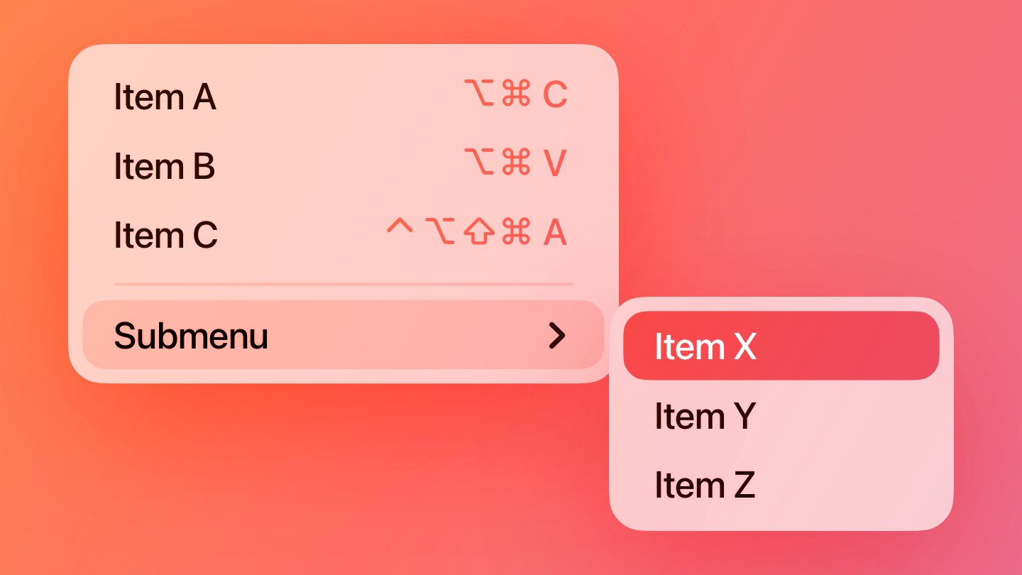
A stylized representation of a menu containing a selected item and displaying a submenu. The image is tinted red to subtly reflect the red in the original six-color Apple logo.
Menus
A menu reveals its options when people interact with it, making it a space-efficient way to present commands in your app or game.

A sketch of the Siri icon. The image is tinted blue to subtly reflect the blue in the original six-color Apple logo.
Siri
People use Siri to help them with the things they need to find, know, or do every day.

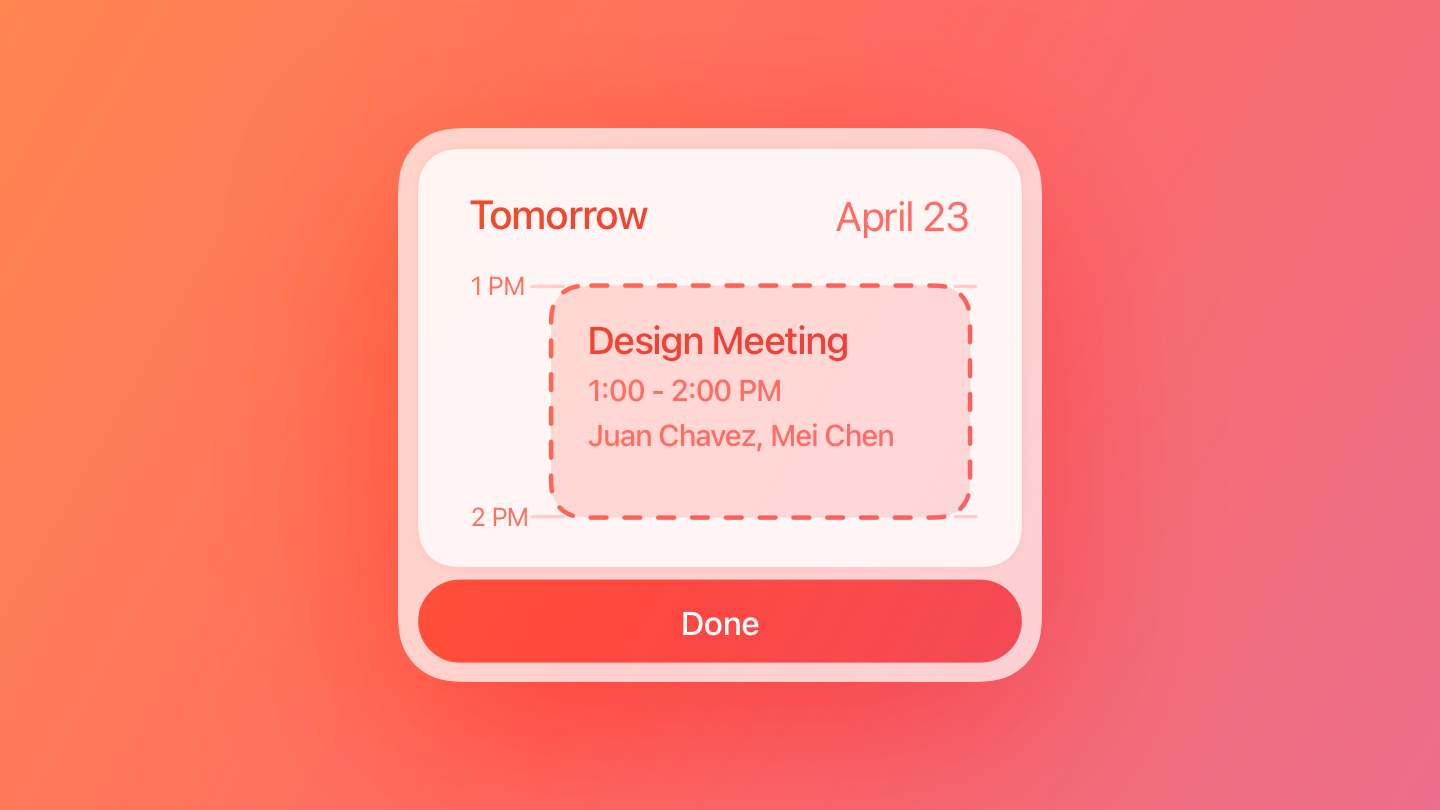
A sketch of a snippet. The image is tinted red to subtly reflect the red in the original six-color Apple logo.
Snippets
When someone performs a task with Siri or an App Shortcut, a snippet shows the result or asks for confirmation.

Contents


Source: https://developer.apple.com/design/human-interface-guidelines

Home

Clone this wiki locally