feat(sidebar): the app-shell navigation family - #645
Conversation


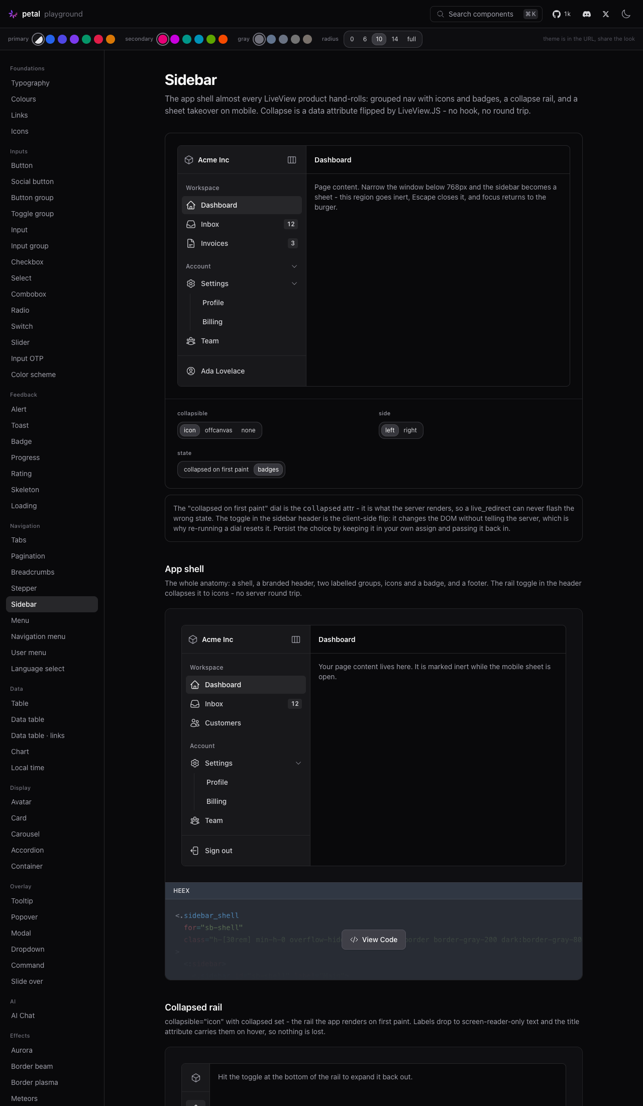
Five components composing the whole anatomy, CSS-first and hook-free:

- sidebar_shell: flex wrapper; renders the content region as <for>-main
  so the sheet has something to mark inert
- sidebar: the <nav> landmark, header/footer slots, and the collapse +
  sheet machinery on data attributes
- sidebar_group: labelled, optionally a WAI-ARIA disclosure
- sidebar_item: icon (name / function / raw svg), label, badge, active,
  four link_types, and self-nesting sub-items
- sidebar_trigger: target="collapse" for the rail, target="mobile" for
  the sheet; only the mobile one claims the focus-restore id

Collapse modes icon / offcanvas / none, side left / right. Multi-sidebar
falls out of the design: every id and JS target derives from the
sidebar's own id, so two in one shell cannot cross-wire.

State: the trigger flips data-collapsed via JS.toggle_attribute and CSS
does the rest - no round trip. The server owns the initial value through
the collapsed attr, so a live_redirect cannot flash the wrong state. No
persistence plumbing ships; on_click/on_close are the seams.

Mobile sheet matches the dev.exs mobile menu grammar: focus_wrap, inert
background, Escape, scrim dismiss, focus back to the trigger. Escape is
gated with JS.exec on a [data-mobile-open='true'] selector so it is a
no-op on desktop, and focus_wrap's sentinels are CSS-disabled unless the
sheet is open, or it would fence the whole page.

Naming dodges sidebar_layout deliberately - Petal Pro and Boilerplate
both ship one, and an import conflict is a hard compile error.

Styles land in their own @layer components block: everything after the
showcase-props section sits outside any layer, and unlayered rules beat
consumer utilities passed via class.

Accessibility: nav landmark with an accessible name, aria-current="page"
on the active item at any depth, disclosure ARIA on groups and parent
items, labels kept in the a11y tree (sr-only, not display:none) when the
rail collapses, prefers-reduced-motion honoured.

Cmd+B is NOT shipped: phx-key has no modifier predicate, so it needs a
hook. Flagged for sign-off rather than sneaked in.

Showcase: app shell, collapsed rail, collapsible groups, right-hand
inspector. Playground: /c/sidebar with collapse-mode, side, collapsed
and badge dials.

59 component tests. 972 Elixir / 157 JS. Live-verified in light and
dark, the icon rail, and the sheet at 390x844.

Co-Authored-By: Claude Opus 5 (1M context) <noreply@anthropic.com>

Codecov Report✅ All modified and coverable lines are covered by tests. Additional details and impacted files@@ Coverage Diff @@
## main #645 +/- ##
==========================================
+ Coverage 92.40% 92.63% +0.23%
==========================================
Files 119 121 +2
Lines 5066 5230 +164
==========================================
+ Hits 4681 4845 +164
Misses 385 385 ☔ View full report in Codecov by Harness. 🚀 New features to boost your workflow:
|


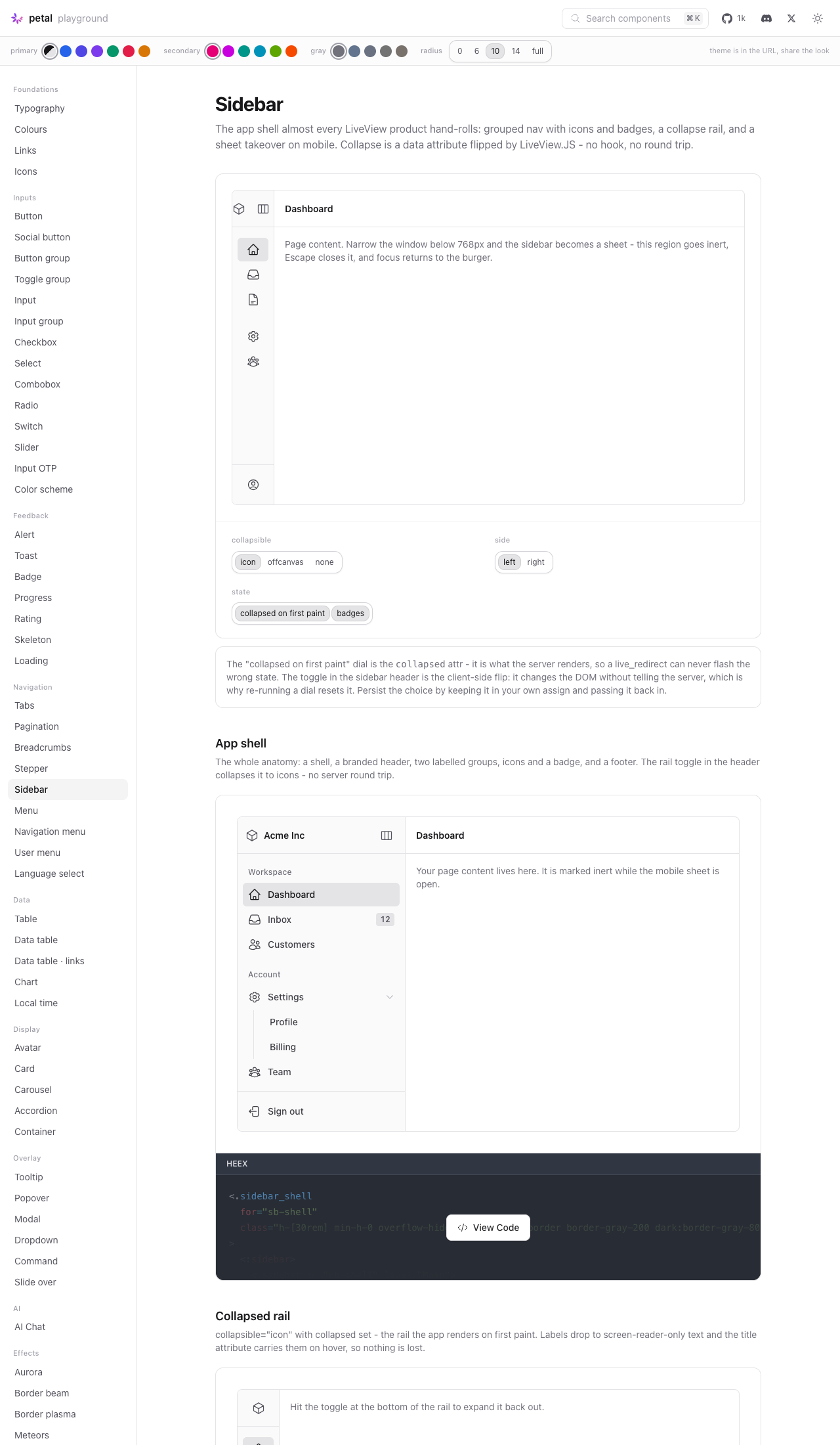
ScreenshotsCollapsed rail — labels drop to sr-only
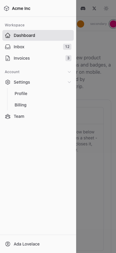
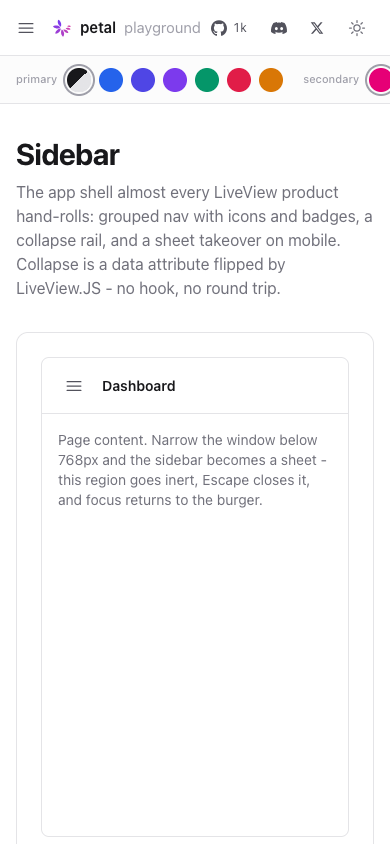
Mobile off-canvas at 390x844, open and closed
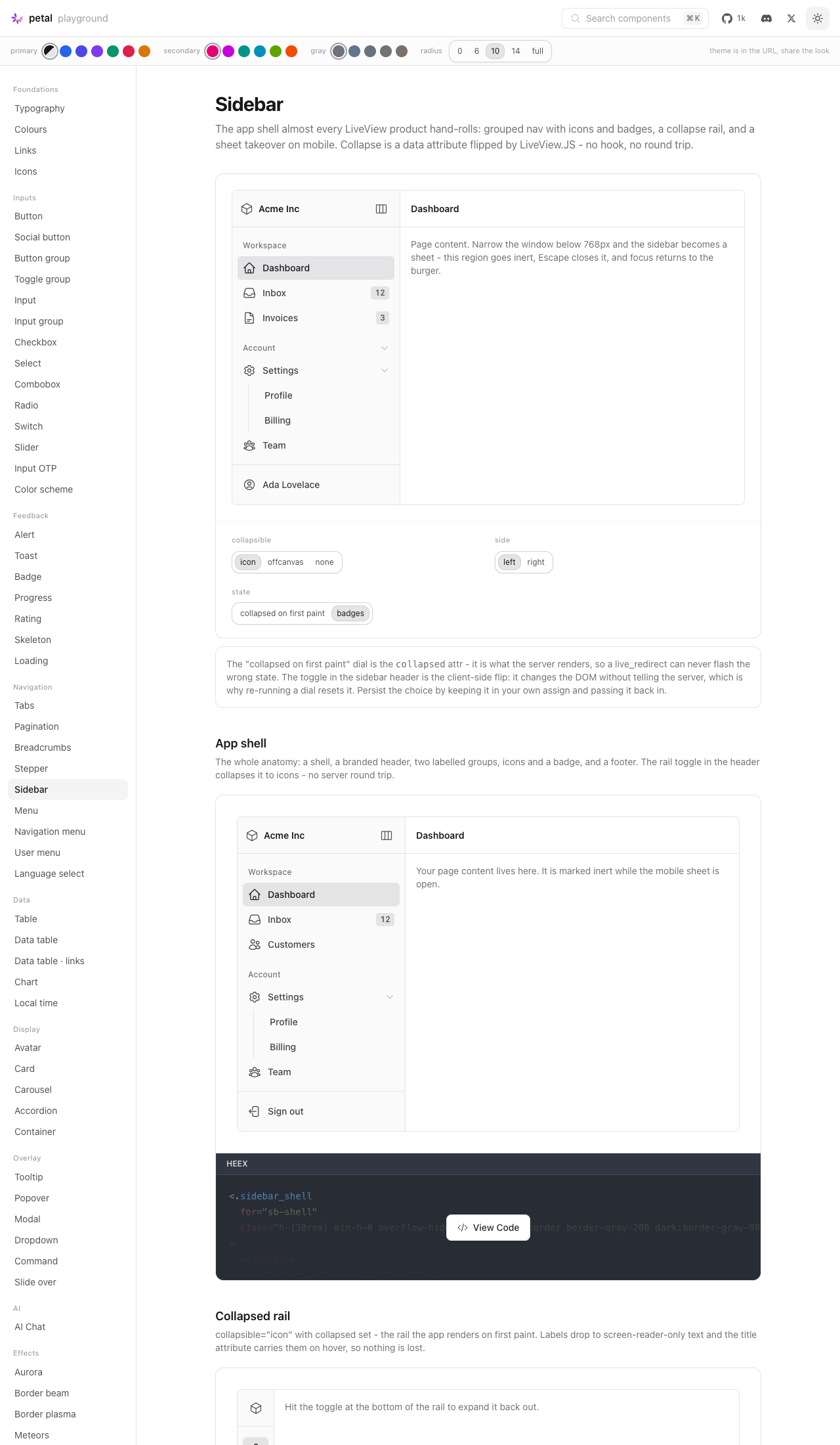
Light / dark
Verified independently
The
|

Phase 1 spec, reconstructed from the build#622 asked for a written spec and maintainer sign-off before any component code landed. That gate did not happen: the branch shipped 1,969 lines across 8 files first, and the PR description was written afterwards as the spec. This comment exists so you can rule on the design without reading the diff. It is not a re-run of the author's write-up. For each question #622 required the spec to settle, it states what the build actually chose (read out of the code, not the prose), the evidence, what was foregone, and where the choice looks risky. Where the PR description and the code disagree, the code wins and the disagreement is called out. Read the risk register first. One item there is a build-breaking regression for petal.build itself, and it is the exact class of failure #622 flagged as critical. Q1. Composition anatomyChosen: five function components, all exported flat. Slots absorb the rest.
Header and footer are slots on Foregone
Risk
Q2. The namespace questionChosen: a flat Foregone
Risk: the survey missed a live collision, and it is the flagship nameThe PR body says the layout wrapper "is the single highest-collision name in the family and it is the one we do not take", and that "the other five names are self-prefixed and collide with essentially nothing". That is wrong for the bare
The Elixir semantics matter here, and are worse than "silent shadow". I reproduced both on 1.19.4:
Notably the two silent-shadow cases are arguably worse than the loud one: an app that defines Petal Pro is clear on all five names ( Options, cheapest first
This is the one decision that is expensive to reverse after a Hex publish. Q3. Collapse behaviour and where state livesChosen: DOM owns live state, server owns initial state, no persistence shipped.
The "no flash on Foregone
Risk
Q4. Mobile behaviourChosen: shares
This matches the Foregone
Two mechanics that need your eyes because both lean on implementation details
Also risky
Q5. Multi-sidebar supportClaimed: supported structurally in v1. Actually: the claim is false as coded for two sidebars in one shell.
These agree only when the shell's The claim is stated in three shipped places: The test that appears to cover this does not: Two ways out
Either is fine. Shipping the sentence without the behaviour is not, because it goes to HexDocs and the MCP schema. Q6. Theming surfaceChosen: two custom properties on .pc-sidebar { --pc-sidebar-width: 16rem; --pc-sidebar-icon-width: 4rem; }( Foregone
Worth your eye
Beyond the six questions
|
| # | Risk | Severity | Evidence |
|---|---|---|---|
| 1 | sidebar/1 collides with downstream locals. petal.build's own main_layout.ex gets a hard CompileError on the next dep bump |
Blocking | main_layout.ex:4,69,387; mix.exs:62 |
| 2 | Multi-sidebar inert target is broken; the claim ships to HexDocs and the MCP schema | Blocking | sidebar.ex:116 vs :427,443; sidebar.ex:137; showcase/sidebar.ex:130 |
| 3 | Footer user-menu composition never built, hiding a likely clip under overflow-hidden |
High | assets/default.css:7628; showcase/sidebar.ex:38-45 |
| 4 | Icon rail leaves an invisible tab stop on .pc-sidebar-group__toggle, and parent items keep aria-expanded on panels CSS permanently hides |
High (a11y) | assets/default.css:7795-7804; sidebar.ex:317,328 |
| 5 | focus_wrap sentinel suppression depends on a LiveView internal, untested |
Medium | assets/default.css:7642 |
| 6 | #<id>-trigger is an undocumented hard contract; a custom mobile trigger id silently breaks focus restore |
Medium | sidebar.ex:337,427,443,445 |
| 7 | Scrim is bg-gray-950/50 with no dark variant, unlike every other overlay |
Low | assets/default.css:7852 |
| 8 | No rail affordance; the toggle must be placed by hand | Low, by design | sidebar_rail dropped |
| 9 | CHANGELOG ### Unreleased will conflict with sibling component PRs |
Housekeeping | CHANGELOG.md:2 |
Approve / adjust
Answer inline. Everything below is a design call, not a code review item.
Namespace (must answer before merge)
- Keep
sidebar/1as-is and fix petal_marketing separately - Rename
sidebar/1(suggestsidebar_nav/1), keep the rest flat - Move the whole family to opt-in
PetalComponents.Sidebar, Chat-style - Add
except:/only:touse PetalComponents(here, or a separate PR)
Multi-sidebar
- Fix it: add
main_idtosidebar/1and test two sidebars in one real shell - Scope it out: one sidebar per shell, correct the attr doc, showcase text and CHANGELOG
Anatomy
- Five components with slots is right
- Bring back
sidebar_rail/1as an edge affordance - Something else:
Collapse state
- Client-only default with documented escape hatches is right for v1
- Want cookie persistence in v1 after all
Mobile
- Inline sheet sharing
slide_over's grammar is right - The CSS-disabled
focus_wrapsentinels are acceptable - Prefer server-owned sheet state instead
Open calls
- Cmd+B hook: yes / no
-
vertical_menu: leave as-is / soft-deprecate / deprecate - Footer user-menu example: build it here / follow-up issue
-
dev.exsmobile-menu dogfood swap: here / follow-up issue - Unlayered
default.csstail: open an issue
Theming
- Two custom properties and a fixed
mdbreakpoint is the right v1 surface
Once the namespace and multi-sidebar rows are answered, everything else in the risk register is bounded polish and the branch can come out of draft.
2 participants


Closes #622
Draft, and deliberately so. #622 is a two-phase brief: the spec gets signed off before the code lands. The spec is below, written as decisions with rationale. The code is pushed alongside it so the decisions are readable as working software rather than prose, but the spec is the thing to review first - if a decision goes the other way, the code follows it.
Summary
Five function components, all CSS-first, no hook, no new dependencies:
sidebar_shell/1sidebar/1<nav>landmark, withheader/footerslots and the collapse + sheet machinerysidebar_group/1sidebar_item/1sidebar_trigger/1target="collapse") or the mobile burger (target="mobile")Three collapse modes (
icon,offcanvas,none),side="left"|"right", multi-sidebar by construction.Phase 1: the spec
1. Composition anatomy
Decision: five function components, with slots collapsing the rest.
shadcn's ~25 sub-components exist because React has no slot primitive. Phoenix does, so:
SidebarHeader/SidebarFooter→<:header>/<:footer>slots onsidebar/1SidebarContent→ the defaultinner_blockSidebarMenu+SidebarMenuItem+SidebarMenuButton→ onesidebar_item/1SidebarMenuSub+SidebarMenuSubItem→sidebar_item/1nested insidesidebar_item/1(self-recursive, which a slot cannot be - this is why items are a function and not a slot)SidebarMenuBadge→ thebadgeattrSidebarGroupLabel+SidebarGroupContent→ attrs onsidebar_group/1SidebarProvider→sidebar_shell/1, which owns nothing but layout and the inert targetSidebarRail→ dropped as a separate component, see deviationsGroups and items are functions rather than slots specifically because sub-items need arbitrary depth. Everything that does not need recursion is a slot, per
accordion.ex/navigation_menu.exhouse style.2. The namespace question
Decision:
sidebar_*prefix family, exported fromuse PetalComponents.Survey of what the names have to dodge:
lib/petal_components.exexports nothing starting withsidebar.Menuowns the adjacentvertical_menu/menu_group/vertical_menu_item; no collision.Phoenix.Componentandphx.newcore_components: nosidebar*.sidebar_layout/1built onvertical_menu, and plenty of hand-rolled apps define one too. An import conflict is a hard compile error - you cannot shadow an import with a local of the same name/arity - so exportingsidebar_layoutwould break those installs onmix deps.update.So: the layout wrapper is named
sidebar_shell/1, notsidebar_layout/1. That is the single highest-collision name in the family and it is the one we do not take. The other five names are self-prefixed and collide with essentially nothing.I considered the
PetalComponents.Chattreatment (namespaced, opt-in, excluded fromuse PetalComponents) and rejected it. Chat is excluded because its members have generic names (markdown/1) that no amount of care fixes. The sidebar family is the opposite case: the names are already namespaced by their prefix. Chat is also a niche add-on, whereas the sidebar is the flagship block component - making it the one family that imports differently would be a permanent ergonomics tax to dodge a one-time, loud, one-line-fixable compile error.One thing I'd like your call on, and did NOT ship:
lib/petal_components.exisdefmacro __using__(_)- it ignores opts, so a consumer who does collide has no way to sayuse PetalComponents, except: [sidebar: 1]. Their only escape is droppinguse PetalComponentsin that one module and hand-importing. Addingexcept:/only:passthrough is a ~10 line non-breaking change that would defuse this and every future name collision. It felt like scope creep on a component PR and it touches the library's front door, so it's yours to decide. Happy to add it here or in a separate PR.3. Collapse behaviour and where state lives
Decision: the DOM owns the live state, the server owns the initial state. No cookie, no hook, no round trip.
data-collapsed="true"|"false"on the sidebar viaJS.toggle_attribute. CSS does everything else. Toggling is instant and costs nothing.collapsedattr, rendered server-side into that same attribute.That second point is the whole answer to "how does a
live_redirectnot flash the wrong state": there is no client-side read-then-apply step to flash. The attribute arrives correct in the first byte of HTML. shadcn needs the cookie read in middleware for exactly this reason; in LiveView the app already has somewhere to put it.Escape hatches, in increasing order of durability:
collapsed={@sidebar_collapsed}, pluson_click={JS.push("toggle_sidebar")}on the trigger so the server hears about it. Surviveslive_patchandlive_redirectwithin the LiveView's lifetime.handle_eventand read it inmount(or in the plug pipeline for dead renders). Survives everything.The component ships no persistence plumbing at all, per the issue's non-goals.
on_clickandon_closeareJSattrs composed ahead of the component's own commands (thecompose_js/2house pattern), which is the whole seam.Non-goal I'm respecting loudly: Cmd+B is not shipped.
phx-window-keydown+phx-keymatches onkeyonly, with no modifier predicate, so a hook-free Cmd+B would fire on every bareb- including inside text inputs. The issue says to flag a hook for sign-off rather than sneak one in, so: do you want a hook for this? It'd be ~15 lines and the library's fourth. My lean is no for v1; apps that want it can bind it themselves and callPetalComponents.Sidebar.toggle_sidebar/1, which is public for exactly this.4. Mobile behaviour
Decision: shares
slide_over's interaction grammar, does not reuse the module.slide_over/1is a modal dialog with a title bar, a close button,role="dialog"andaria-modal. A nav sheet is a navigation landmark. Wrapping the nav in a dialog would either double the landmark or lose it, andslide_overpush-pushes aclose_slide_overevent that the app must handle - which would drag server state into a component that otherwise needs none. So the sheet is built inline, matching thedev.exsmobile menu grammar point for point:dev.exsmobile menu<.sidebar>focus_wrapfencefocus_wraparound the panelinerton background regionsinertset on#<id>-mainby the trigger, removed on closephx-window-keydown+phx-key="escape"phx-remove={JS.focus(to: burger)}JS.focus(to: "#<id>-trigger")in the close commandphx-clickon.pc-sidebar__scrimTwo mechanics worth flagging in review, because both are slightly clever:
Escape is gated on a selector, not on server state.
dev.exscan:if-render the overlay because@nav_openis an assign; here the state is in the DOM. So the keydown runsJS.exec("data-close", to: "#<id>[data-mobile-open='true']")- if the sheet is shut the selector matches nothing and the whole command is a no-op. That's how Escape on desktop avoids yanking focus to the trigger.focus_wrap's sentinels are CSS-disabled unless the sheet is open.focus_wraptraps Tab whenever it's in the DOM, which on desktop would fence the entire page inside the sidebar. Since it can't be conditionally rendered, this rule turns it off instead:display: noneremoves the sentinels from the tab order, so the trap only exists while the sheet is open. It leans onfocus_wrap's rendered shape rather than its ids, but it is leaning on an implementation detail - if you'd rather not, the alternative is making the sheet's open state server-owned likedev.exs, at the cost of every consumer needing ahandle_event. Happy to switch.5. Multi-sidebar support
Decision: supported structurally in v1, documented via the inspector example.
There is no shared/global state to collide over - every id, data attribute and JS target is derived from the sidebar's own
id. Two sidebars in one shell with different ids simply cannot cross-wire, and there are tests asserting that for both the sidebars and their triggers.side="right"+collapsible="offcanvas"is the inspector-panel shape, shipped as a showcase example.The one shared thing is the shell's
-mainregion, which both would mark inert - correct behaviour, since either open sheet should fence the page.6. Theming surface
Decision: two custom properties on
.pc-sidebar.Both are read by the width rules, so an app retunes by setting them on
.pc-sidebar(or per-instance viastyle), never by overridingpc-*internals.The breakpoint is not a variable and cannot be. CSS media queries can't read custom properties. It's fixed at
md(48rem) to match the rest of the library. Container queries would make it configurable-ish and are a fair follow-up, but they'd change the layout contract, so not in v1.Relationship to
menu/navigation_menu/user_dropdown_menuThis is the question I most want checked, since the brief explicitly warns against forking a fourth navigation implementation.
What it does NOT duplicate.
navigation_menuis a horizontal top-nav with hover-opened mega-menu panels - different axis, different interaction, no overlap.user_dropdown_menuis a popover of account links; the sidebar<:footer>slot is designed to hold one, and the issue's own playground spec asks for exactly that composition.Where it genuinely overlaps:
vertical_menu. Both render a vertical run of nav links with icons, active state and nested disclosures. The honest position:vertical_menu. They have incompatible API shapes.vertical_menuis data-driven (menu_items={[%{name:, label:, path:, icon:, menu_items: [...]}]}+current_page={:atom}, with active state inferred by matchingnameagainstcurrent_page).sidebar_itemis slot-composed, withactivepassed explicitly and never inferred. The issue's non-goals rule out a data-driven list API here, and it rules out inferring active state - sosidebar_itemcould not have beenvertical_menuunderneath without violating both.vertical_menualso can't collapse. Its markup has no seam for an icon rail: the label is a plain<div>with no hook for the collapsed treatment, submenus are toggled by inlinestyle="display:..."set server-side (which fights any CSS-driven collapse), and there's notitle/sr-only handling for iconified state. Making it collapsible would be a breaking change to its markup.vertical_menualso emits one<nav>per group, which is wrong for an app shell (a shell wants one landmark with one accessible name).<.sidebar>emits exactly one<nav aria-label>and groups are plain<div>s.So they are two shapes of the same idea, and I did not fork the styling doctrine -
pc-sidebar-itemfollowspc-vertical-menu-item's structure and gray ramp deliberately.What I did not do, and think is yours to call: the issue says "the spec decides
vertical_menu's future, not this build." My read is that<.sidebar>supersedesvertical_menufor app shells, andvertical_menushould stay as the data-driven primitive for apps that want to pass a list (petal_pro'ssidebar_layoutis built on it and shouldn't be disturbed). I'd deprecate nothing in this PR. Flag if you disagree.Dogfood target. The
dev.exsmobile menu (its comment already says "the sidebar primitive planned for 4.9 replaces this and inherits its grammar") - I've confirmed the component can express it: grouped items, active state, the full sheet grammar, andlink_type="button"+phx-value-*globals for thephx-click="select"wiring it uses. I have not done the swap in this PR - it's cross-cutting and would muddy the review of a new component. Happy to ticket it as the immediate follow-up, or do it here if you'd rather see it proven.Deviations from the issue's API sketch
sidebar_layoutor provider wrappersidebar_shell/1sidebar_layoutis the one name that would break Petal Pro / Boilerplate installs on import conflict. See §2.sidebar_rail/1as its own componentcollapsible="icon"+collapsed), not a separate element. A sixth exported name to render a click strip is collision surface for no expressive gain -sidebar_triggeralready gives you the click target and can be placed in the header, footer or your topbar.sidebar_triggertakesid(of the sidebar it toggles)for, andidis its ownidmeaning "some other element's id" reads wrong and makes focus-restore targeting ambiguous.foris the reference;iddefaults to"<for>-trigger"so the close command can restore focus to it.sidebar_shellusesforfor the same reason.sidebar_itemlink_typedefault"live_redirect"sidebar_itemicon: name / function / raw SVGmenu.ex'smenu_iconconvention exactlytarget="collapse"/target="mobile"isMobilein JS. Without a hook there's no server-side breakpoint, so one trigger toggling both states would silently flip the desktop rail while you were on mobile. Two explicitly-targeted triggers (each hidden at the other breakpoint by CSS) is honest and matches how real shells are laid out - burger in the topbar, rail toggle in the sidebar header.Also worth noting: #640 (
feat/resizable) is an obvious pairing and I deliberately did not touch it. This is built againstorigin/mainonly and ships no resize machinery (v1 non-goal). Ifresizable_group/panel/handleland, a drag-to-resize sidebar should compose them and set--pc-sidebar-widthfrom the panel size rather than growing its own.Styles
New
pc-sidebar*section inassets/default.css, appended inside its own@layer components { }block.That last bit matters and is worth a maintainer's eye: everything after the showcase-props section (line ~7016) currently sits outside any cascade layer, so those rules outrank consumer utilities passed via
class. Appending into that tail would have quietly broken<.sidebar class="...">overrides. The new block re-opens a layer. The pre-existing unlayered carousel section above it is untouched but is probably a latent bug worth its own issue.Otherwise:
--pc-radiusconsumed via the usualmax(calc(...))derivation, gray ramp for all neutrals,dark:throughout,focus-visiblerings only (no persistent:focusfills), andprefers-reduced-motionreducing every transition to instant.Accessibility
<nav>landmark per sidebar with anaria-label(defaults to"Sidebar", overridable)aria-current="page"on the active item, at any nesting depth; passed by the app, never inferredaria-expandedon the trigger,aria-controlspointing at the panel)sr-only(notdisplay: none), withtitlecarrying the same text for sighted hoverfocus_wrapfence,inertbackground, Escape, scrim dismiss, focus restored to the triggerprefers-reduced-motion: reducedrops all transitionsHook
None. Collapse, disclosure, the sheet, Escape and focus restoration are all
Phoenix.LiveView.JS+ CSS.npm testis unchanged at 157 because there is no JS to test. The only thing that wanted a hook was Cmd+B, and it's flagged rather than shipped.Tests
mix testnpm testmix credomix format --check-formattedandmix compile --force --warnings-as-errorsboth clean.Every attr, every value in every
values:list, every slot and everylink_typehas a rendering assertion. ARIA is asserted explicitly rather than via class checks (aria-current,aria-expanded,aria-controls,aria-label, theinert/focus_wrapwiring), and there are tests specifically asserting two sidebars and two triggers do not cross-wire.Verified by hand in the playground
Light and dark at 1280px, the collapsed icon rail, and the mobile sheet at 390x844 (both closed, confirming the sidebar leaves the flow entirely, and open with the scrim over the content region). Screenshots below.
Three things the browser caught that the test suite could not, all fixed:
[data-side="left"] .pc-sidebar__panel { transform: translateX(-100%) }carries a:not()plus two attribute selectors; the open rule was one selector lighter, so it lost the tie and the panel stayed off-screen while the scrim dimmed the page. The open rule now carries matching weight. Pure CSS specificity - invisible torendered_to_string.id. Both defaulted to"<for>-trigger", which is also the focus-restore target. Onlytarget="mobile"claims it now; there's a test for it.--pc-sidebar-icon-widthis 4rem.