feat(slider): single and dual range slider on native inputs - #636
feat(slider): single and dual range slider on native inputs#636mplatts wants to merge 2 commits into
Conversation


<.slider> promotes the range control to a first-class component, absorbing
the display work that lived in field.ex/input.ex and adding what those
types could not carry.

Built on native <input type="range">, so the arrow / Home / End / PageUp /
PageDown keyboard map, role="slider", aria-valuemin/valuemax/valuenow and
form posting all come from the browser rather than being re-implemented.
Dual mode is the standard two-overlaid-inputs technique, which native
cannot do with one element.

- single and dual modes, inferred from field vs min_field/max_field/values,
  with a clear ArgumentError on ambiguous combinations
- marks: ticks under the track, optional labels, inverting to the
  on-primary treatment once the fill swallows them
- show_value: a tooltip bubble on hover/focus-visible, or an inline readout
  in the label row, both with prefix/suffix
- sizes sm/md/lg, vertical orientation via writing-mode, disabled
- values clamped and ordered server-side, so the fill can never paint
  backwards and a reversed pair renders in order

Geometry rides --pc-slider-pct custom properties rendered inline by the
server, so the control paints correctly before the hook connects and with
JS off. Positioning is pure CSS off those properties - nothing is measured.

The PetalSlider hook does only what the client alone can know: keeping the
percentages live while dragging, enforcing the thumb ordering two native
inputs cannot enforce themselves (including the z-index lift when they
meet), and emitting a bubbling petal:slider-change event for apps that
want the value without a form.

field type="range" and type="range-dual" keep working - deprecation notes
only, pointing at <.slider>.

Also: pc-slider CSS section, showcase module + registry entry, the
playground page rebuilt around <.slider> on the existing slider slug,
32 component tests and 18 hook tests.

Co-Authored-By: Claude Opus 5 (1M context) <noreply@anthropic.com>

Codecov Report✅ All modified and coverable lines are covered by tests. Additional details and impacted files@@ Coverage Diff @@
## main #636 +/- ##
==========================================
+ Coverage 92.40% 92.75% +0.35%
==========================================
Files 119 121 +2
Lines 5066 5231 +165
==========================================
+ Hits 4681 4852 +171
+ Misses 385 379 -6 ☔ View full report in Codecov by Harness. 🚀 New features to boost your workflow:
|


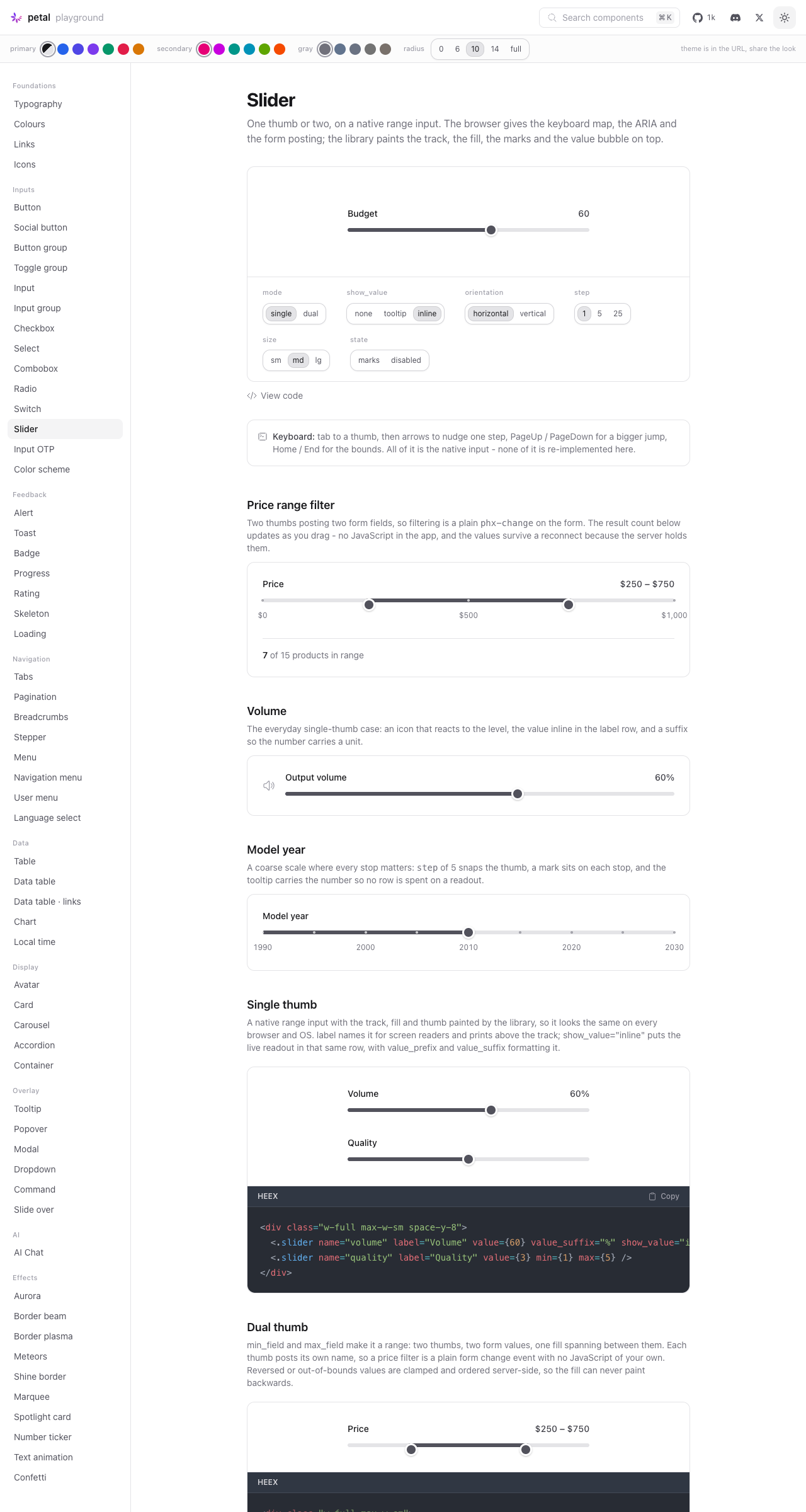
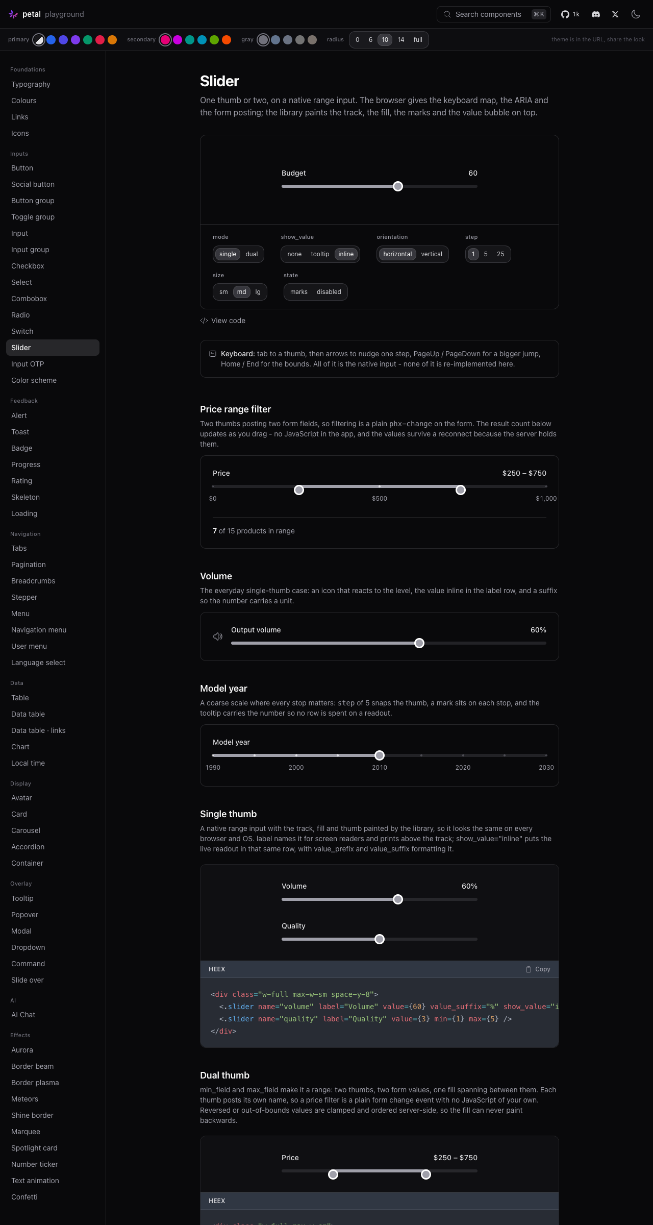
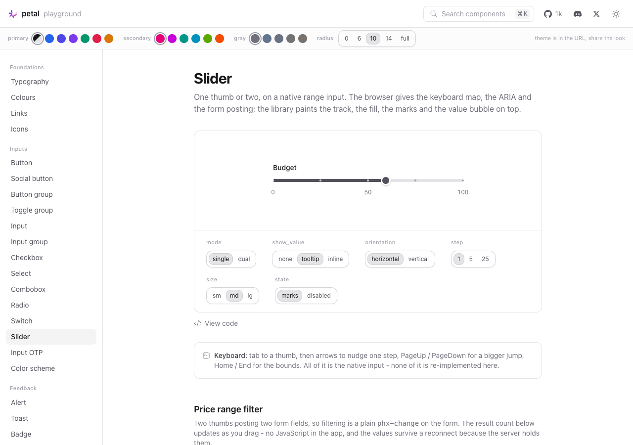
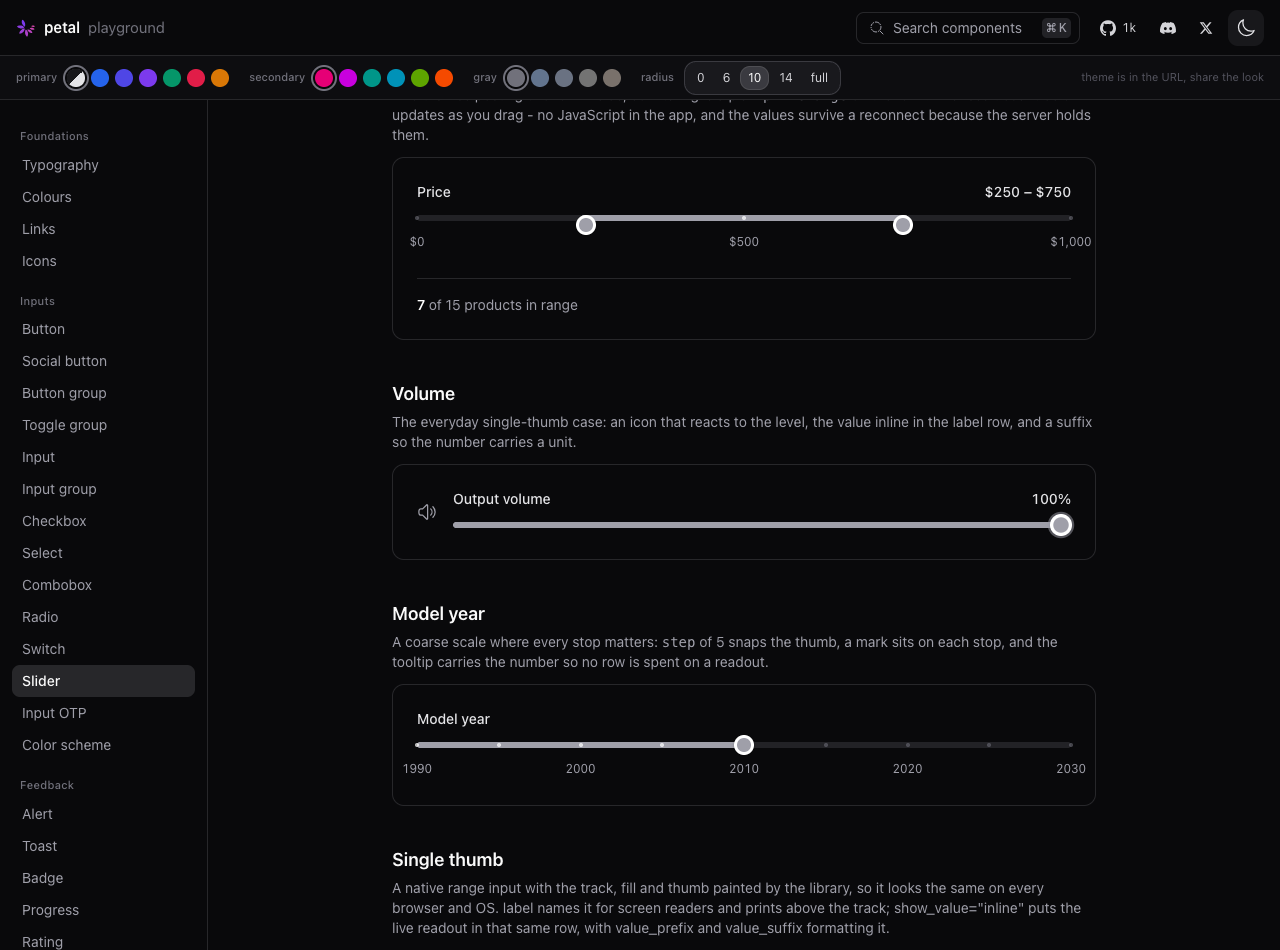
ScreenshotsLight / dark, thumbs at non-default positions
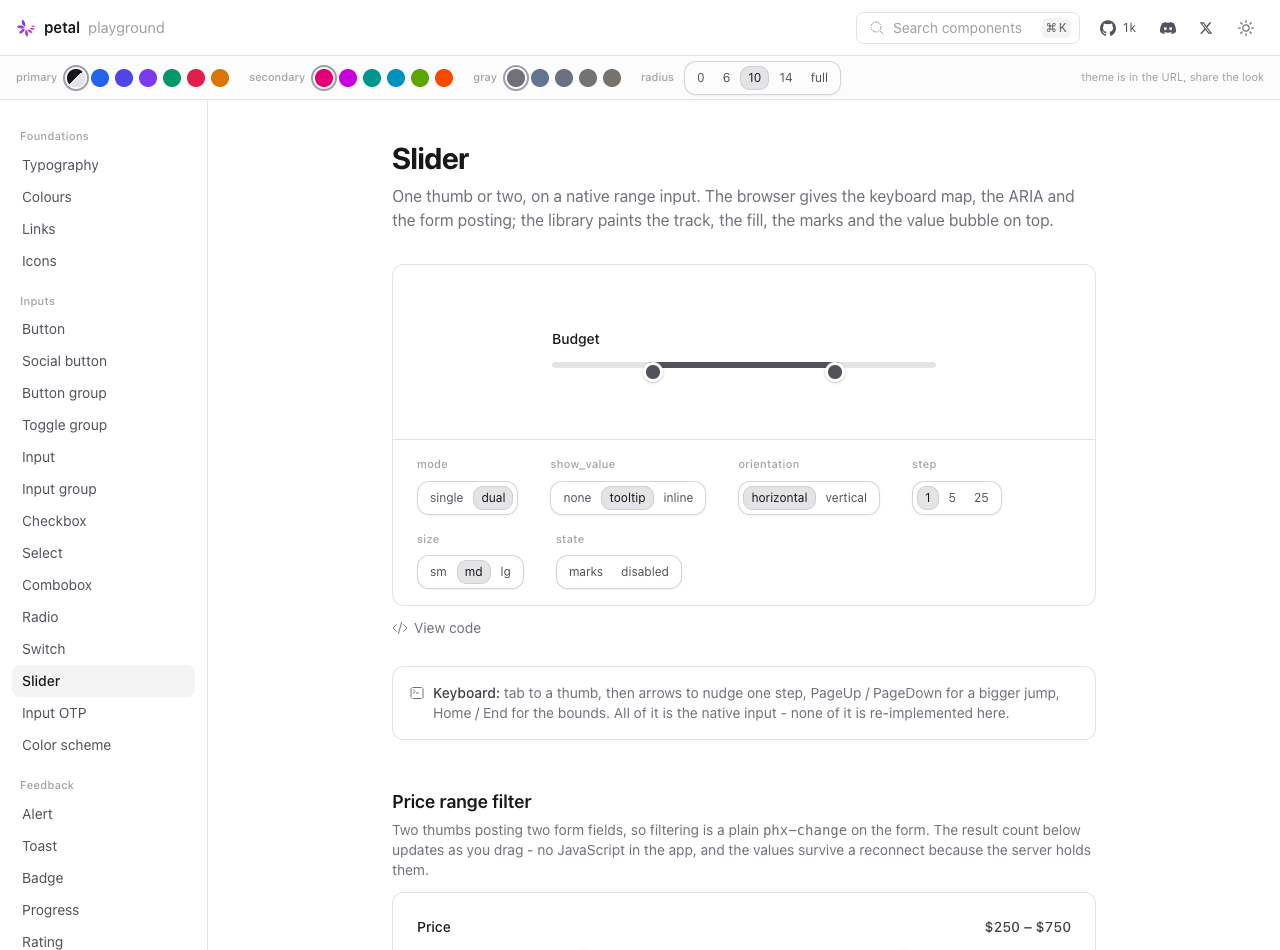
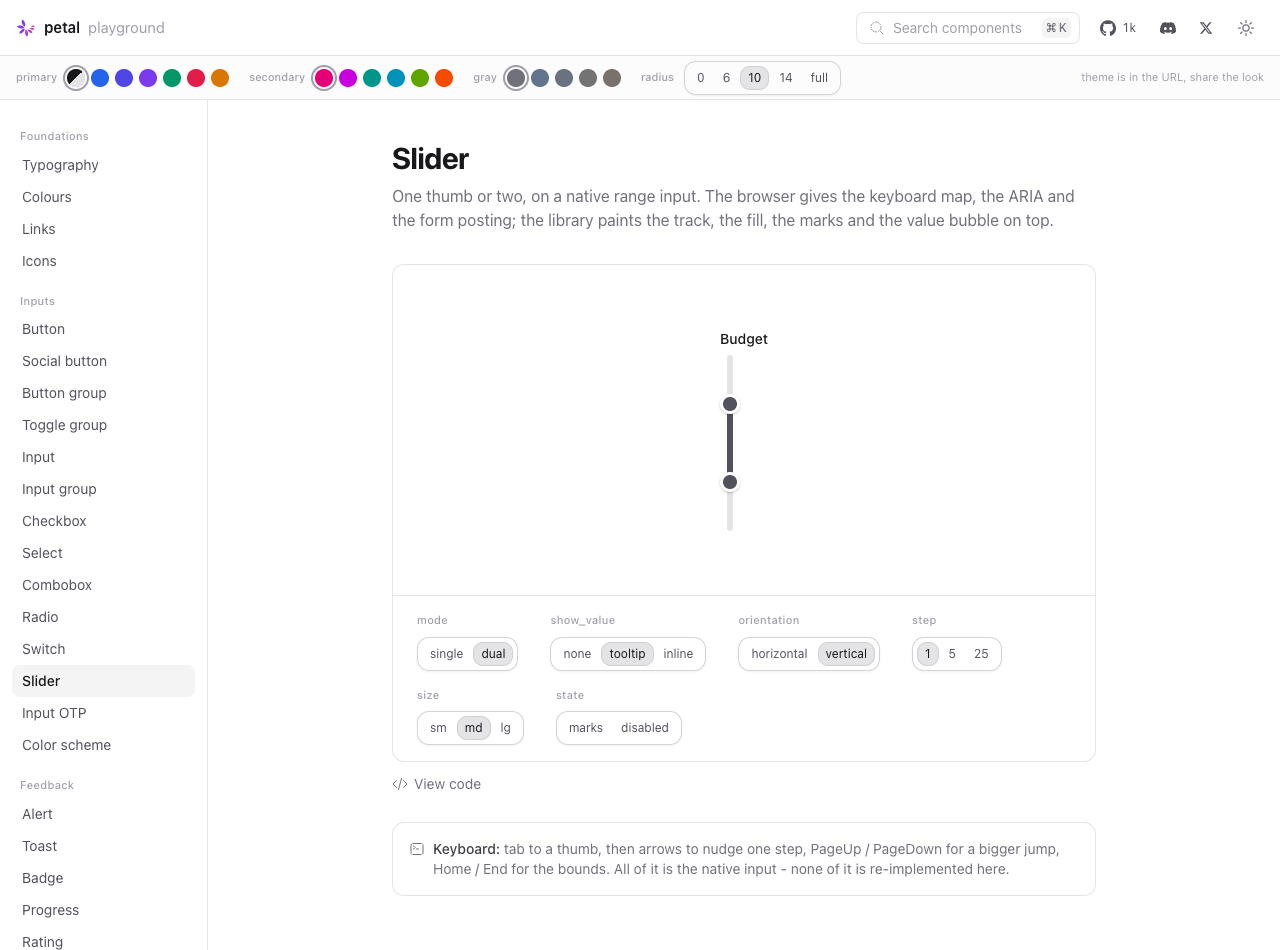
Dials — dual + marks + tooltip, vertical, marks + tooltip
Keyboard — End key driving the value to 100
Verified independently
The slug situation is worth readingThe The Going native Keyboard verified by hand: 60 → 62 (ArrowRight ×2) → 72 (PageUp) → 0 (Home) → 100 (End). Not verified: Firefox (CSS carries both Images live on the |

…translator, anchor geometry to the thumb centre

Audit round on the bulk-built PR.

(1) PetalSlider.mounted() cached the mode, the bounds, the readout
formatting and the input elements, and updated() only re-queried marks.
A <.slider> can change shape under a constant id - the playground's own
mode dial does exactly that on #pg-slider-preview - and single and dual
do not share input elements (_input vs _min/_max), so after that swap
the listeners sat on detached nodes: the fill stopped following the
thumb and the ordering clamp two overlaid natives cannot enforce
themselves never ran again. Extracted bind()/unbind() and called them
from mounted() and updated() alike, with five specs covering the swap,
the clamp on inputs that arrived after mount, re-read bounds and
formatting, no double-binding, and no firing from replaced inputs. All
four of the new behavioural specs fail on the previous hook.

(2) Slider re-implemented a private interpolator for field errors and
ignored config :petal_components, :error_translator_function, so an app
that had wired gettext got translated errors from <.field> and raw
"%{count}" from <.slider>. The translator now lives once in
PetalComponents.Helpers - which is deliberately NOT in the
`use PetalComponents` import list, so no public translate_error/1 lands
in consumer web modules where nearly every app already defines one -
and both field.ex and slider.ex route through it.

(3) The fill, the tooltip and every tick anchored at the raw
percentage, but a native thumb's centre travels from thumb/2 to
width - thumb/2, so at the extremes they sat up to half a thumb off the
thumb they were meant to mark (a tick at the minimum a radius left of
the thumb parked on it). The server now emits a unitless --pc-slider-frac
and the CSS converts it once through --pc-slider-anchor, the same
compensation Radix and shadcn make. The hook rounds to the server's 4dp
so a tick the server painted as filled cannot flip off when JS connects.
A css_assets_test guard pins both halves of the contract.

(4) The vertical mark-label layer was positioned against .pc-slider,
whose box also contains the header row and stretches to the widest
label, so every vertical label came out offset by the header height and
off the track centre horizontally. Moved inside .pc-slider__track-wrapper
- the only element whose box is the track's extent - with the horizontal
case moved out of flow to match and its row reserved with margin.

(5) appearance: slider-vertical is not a value of the standard
appearance property; the legacy WebKit fallback only ever existed as
-webkit-appearance. Written the way it can actually apply.

(6) The inline .pc-slider__value readout is aria-hidden: it is the same
number aria-valuenow already announces, the same call the tooltip and
the marks already made.

Found while writing the tests, beyond the audit list: reversed bounds
(min={100} max={0}) were swapped for clamping but written to the native
inputs as given, and the HTML range spec collapses a control whose max
is below its min, so the browser pinned the thumb at the top while the
server painted the fill halfway. Bounds are now ordered once at the top
of normalise/1, which also retires the clamp/3 reversed-bounds guard.

Also: codecov's red patch lines are covered (slider.ex is at 100%, and
every line moved into helpers.ex is exercised), dev.exs's volume icon
loses a dead clause that returned the same icon as the catch-all, and
the moduledoc now shows a real petal:slider-change listener rather than
just describing one.

mix test 965, 0 failures; npm test 181, 0 failures; mix credo unchanged
(14 refactoring, 31 readability, same as main).
2 participants


Closes #608
Summary
A first-class
<.slider>: single and dual thumb, marks, a tooltip or inline value readout, sizes, vertical orientation and disabled. It absorbs the display work that lived infield.ex/input.exand adds what those types could not carry.Five parts per CONTRIBUTING.md:
lib/petal_components/slider.ex(exported fromlib/petal_components.ex)pc-slidersection inassets/default.css, appended as its own@layer componentsblock, nothing reflowedtest/petal/slider_test.exs(32 tests) andtest/js/slider.test.js(18 tests)lib/petal_components/showcase/slider.ex+ itsregistry.exentrysliderplayground page indev.exs, rebuilt around<.slider>Plus
### UnreleasedinCHANGELOG.mdand deprecation notes on therange/range-dualdocs.Native
<input type="range">, notrole="slider"I went native, as the issue proposed, and the keyboard argument decided it on its own. The WAI-ARIA slider pattern's whole keyboard map — arrows, Home, End, PageUp, PageDown — plus
role="slider",aria-valuemin/valuemax/valuenow, touch and pointer handling, and form posting, all arrive for free and stay correct across browsers and assistive tech. A customrole="slider"implementation would mean re-implementing every one of those and getting them all right, in exchange for styling freedom I did not actually need: the track, fill, thumb, marks and tooltip are drawn as real sibling elements under the input, with the input's own track and thumb painted out. That sidesteps the usual native-styling ceiling, and it fixes a real bug class along the way —dark:and--pc-radiusresolve on real elements but cannot on::-webkit-slider-runnable-track(adark:variant compiles to a trailing:where(.dark, …)ancestor test a pseudo-element can never satisfy, which is why.pc-range-input's track used to stay light in dark mode).On dual and native: correct, one native input cannot carry two thumbs. Dual mode is two overlaid native inputs, each posting its own name — the technique the existing
pc-dual-rangealready uses. That keeps both thumbs individually focusable and keyboard-operable, which a single custom two-thumb widget makes materially harder. It did not push me toward a custom implementation; it is the one place a hook is genuinely required (see below).I verified the keyboard map by hand in the playground rather than assuming it: on the volume slider, 60 → 62 (two ArrowRights), → 72 (PageUp), → 0 (Home), → 100 (End).
CSS-first, and the one thing the hook is for
Geometry rides
--pc-slider-pct(and-min/-max) custom properties that the server renders inline, so the control paints correctly before any JS connects and with JS off entirely. The fill, both tooltips and every tick anchor off those same properties, so positioning is pure CSS with nothing measured.PetalSliderdoes only what the client alone can know:petal:slider-changeCustomEvent for apps that want the value without a formJS.dispatchand CSS cannot do (1) or (2) — there is no declarative hook for "the user is dragging a native range thumb". Everything else is CSS.Deviations from the issue's API sketch
Three additions, no removals. Everything in the sketch is present with the sketched names and defaults.
labeladded. The sketch has no attr that can name the inputs, but an input must never be nameless.labelis the accessible-name base and a visible label above the track; it defaults to the humanised field name. Dual thumbs become"<label> minimum"/"<label> maximum", which is the naming the issue's a11y section asks for.min_name/max_nameadded. The test checklist asks for dual names "fromvalues+ explicit names", but a singlenamecannot express two.values+namederives"<name>_min"/"<name>_max"; these two override it.restapplies to the wrapper, not the inputs. The issue suggests overriding the dual thumbs'aria-labelviarest, butrestis one bag of attributes and dual mode needs two different labels, so it cannot express that.labelis the override instead. Wrapper is also wherephx-hookand the geometry properties live, so it is the natural target.Also: errors from the form field(s) render through
PetalComponents.Field.field_error(merged and de-duplicated across both thumbs, matching howfield.exmerges min/max errors), so<.slider>is usable directly in a form without wrapping it in<.field>.Not done from the issue: the vertical orientation is verified in Chrome only (screenshot below). The issue asks for a VoiceOver pass, which I could not run;
writing-mode: vertical-lr+direction: rtlis the standards-track approach withappearance: slider-verticalas the legacy WebKit fallback, and the input is unchanged otherwise, so the announcement should be identical — but that is reasoning, not a test. Firefox was likewise not exercised; the CSS carries both the::-webkit-*and::-moz-*branches, following the existing split.The pre-existing slider situation
Worth reporting, since it was ambiguous going in:
Slidermodule and no slider commit history.git log --all -- '*slider*'is empty, andlib/petal_components.exhadsliderfree, as the issue said.mainalready had a full, workingsliderpage — but it demoed<.field type="range">andtype="range-dual", pulling its examples from the Field showcase (~w(sliders slider_dual)a). So the slug was real and occupied, not a placeholder.sliderslug and is built entirely on<.slider>, with the six dials the issue specifies (mode, marks, show_value, orientation, step, size — plus disabled) and the three scenarios (price-range filter, volume, year picker), a keyboard hint line, and a closing note pointing at the deprecated field types. Verified it renders and does not fall back to the Button page.origin/dual-range-slideris stale and superseded. Its 10 commits are not reachable frommain, but the feature they built is onmain(squash-merged), so the branch is history, not pending work. I did not build on it; the issue's brief supersedes it.sliders/slider_dualexamples so the deprecated types stay documented on petal.build; both descriptions now say they are superseded by<.slider>.Verification
mix format --check-formattedmix compile --force --warnings-as-errorsmix credoorigin/main)mix testnpm testNo test was weakened or deleted. No new dependencies — no npm package, no hex dep.
Exercised in the playground on :4023: every dial, light and dark, dual, marks, vertical, tooltip-on-hover, and keyboard-only.
Screenshots
Light and dark of the playground page, thumbs at non-default positions so the fill/track relationship is visible.
Also captured while verifying (happy to attach if useful): dual + vertical, marks with the tick inversion inside the fill, and the tooltip bubble anchored to the thumb.
🤖 Generated with Claude Code