feat(alert_dialog): the confirm/cancel gate before destructive actions - #635
feat(alert_dialog): the confirm/cancel gate before destructive actions#635mplatts wants to merge 2 commits into
Conversation


<.alert_dialog> asks one question with two answers and will not let you
leave without answering. Distinct from <.modal>, which stays untouched:

- role="alertdialog" + aria-modal, aria-labelledby -> title,
  aria-describedby -> description (attribute omitted when absent)
- initial focus pinned to cancel (the least destructive action)
- Escape cancels and runs on_cancel; backdrop click does nothing
- default and destructive variants; destructive moves confirm to the
  danger ramp and adds a danger icon the :icon slot can override
- :trigger slot renders a pre-wired opener; open_alert_dialog/2 opens it
  from any element
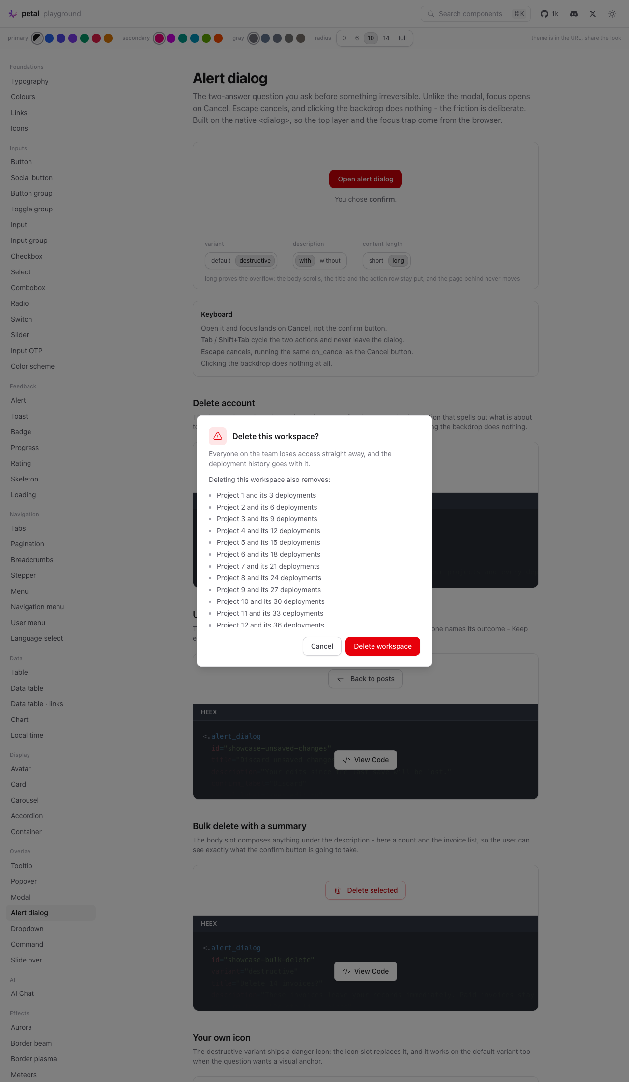
- long bodies scroll inside the panel, header and action row stay put

Built on the native <dialog> rather than the modal's overlay divs:
showModal() supplies the top layer, focus containment and focus
restoration, and a native modal dialog already ignores backdrop clicks -
exactly what this pattern wants. Two small hooks cover only what
Phoenix.LiveView.JS cannot reach: showModal()/close() are DOM methods
with no JS-command equivalent, and Escape's native cancel event must be
intercepted so it runs on_cancel instead of quietly closing.

Showcase: PetalComponents.Showcase.AlertDialog (delete account, unsaved
changes, bulk delete with a live count, custom icon), registered in the
showcase registry.

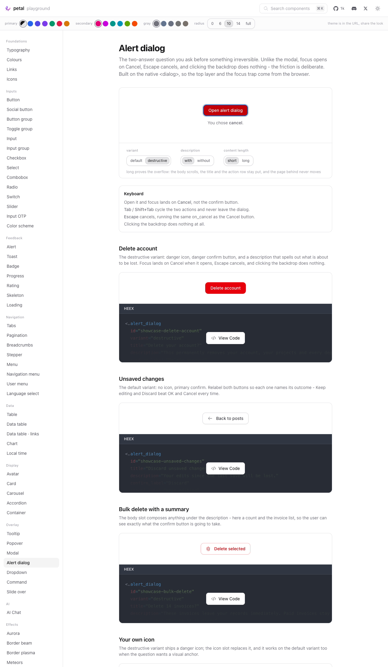
Playground: /c/alert-dialog with variant, description and content-length
dials, a keyboard map, and the showcase examples.

Tests: mix test 913 -> 945 (0 failures, 1 skipped);
npm test 157 -> 172. Zero new credo entries.

Co-Authored-By: Claude Opus 5 (1M context) <noreply@anthropic.com>

Codecov Report✅ All modified and coverable lines are covered by tests. Additional details and impacted files@@ Coverage Diff @@
## main #635 +/- ##
==========================================
+ Coverage 92.40% 92.48% +0.08%
==========================================
Files 119 121 +2
Lines 5066 5123 +57
==========================================
+ Hits 4681 4738 +57
Misses 385 385 ☔ View full report in Codecov by Harness. 🚀 New features to boost your workflow:
|


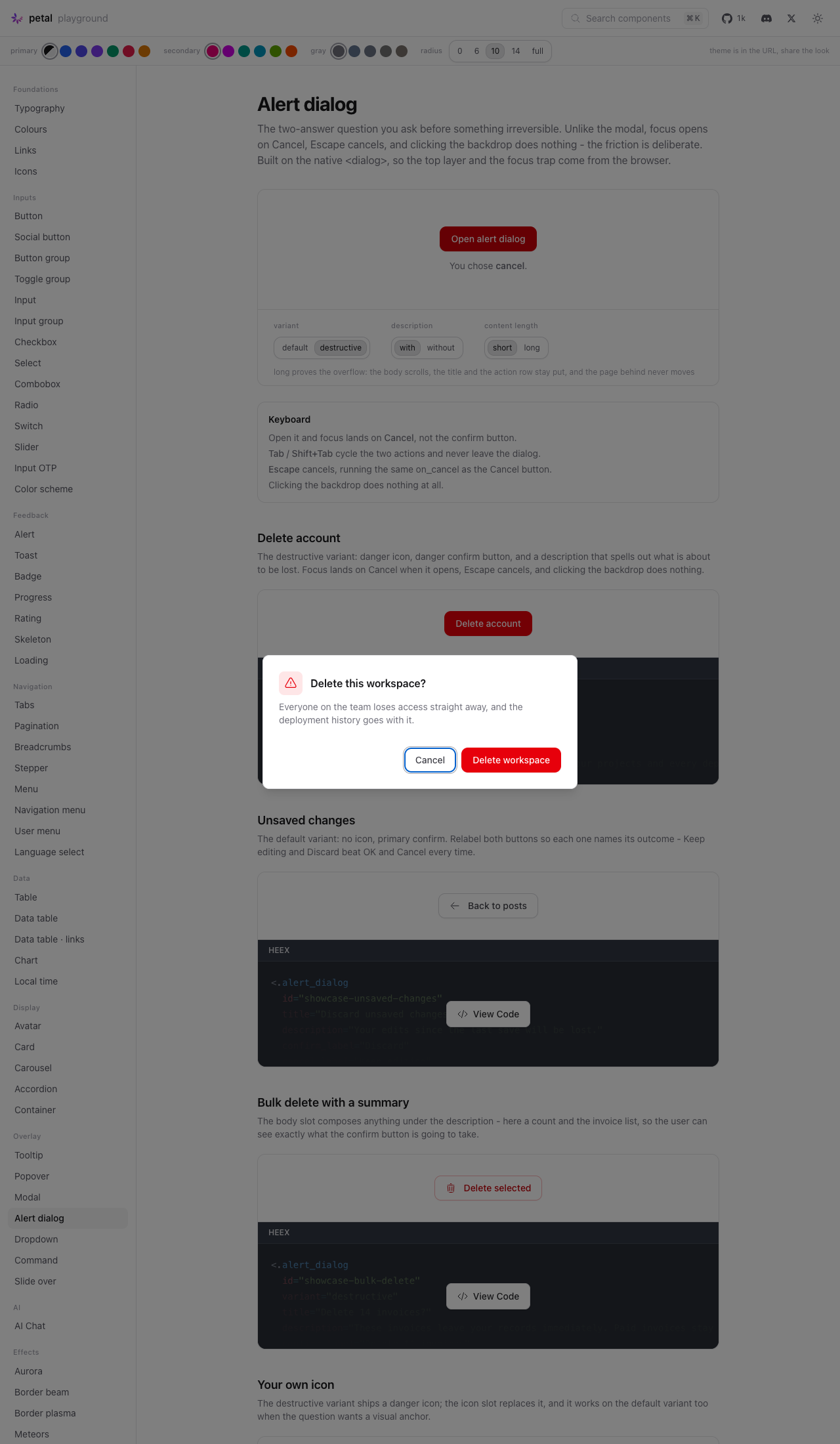
ScreenshotsDialog open
Page
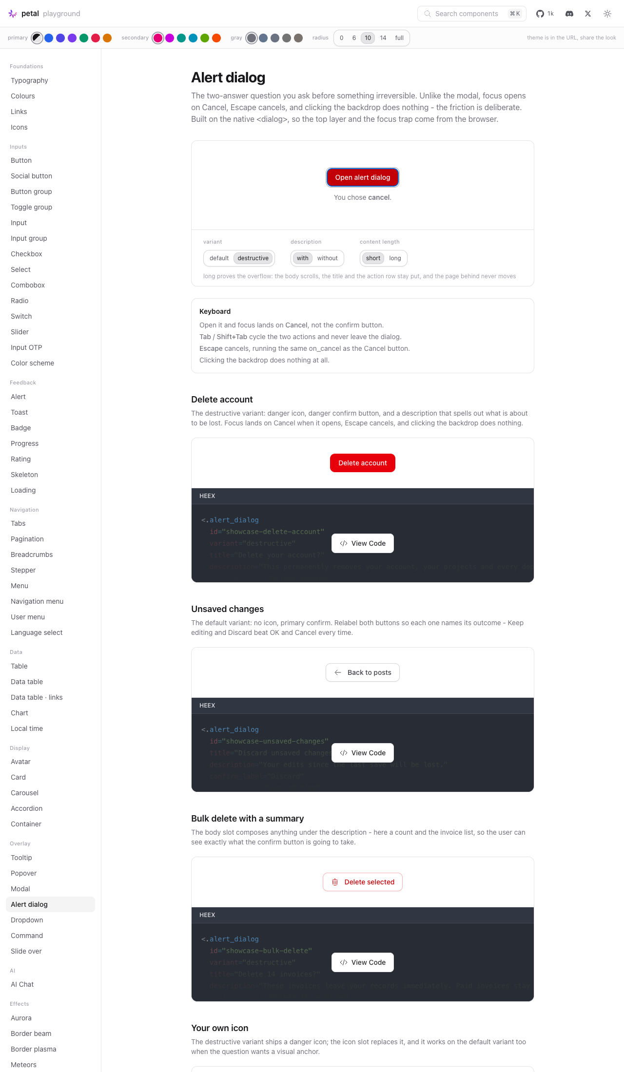
Behaviour proofs — Escape, backdrop click, Enter landing on Cancel, long-content scroll
Verified independently
A correction to the issue's premiseThe brief expected backdrop-close would need suppressing. It doesn't — a native modal The a11y requirements were verified functionally rather than visually: opening and pressing Enter without touching anything acknowledged A real bug was caught and fixed mid-pass: with long content the panel's percentage @nhobes — two calls for you: confirm/cancel are composed from Images live on the |
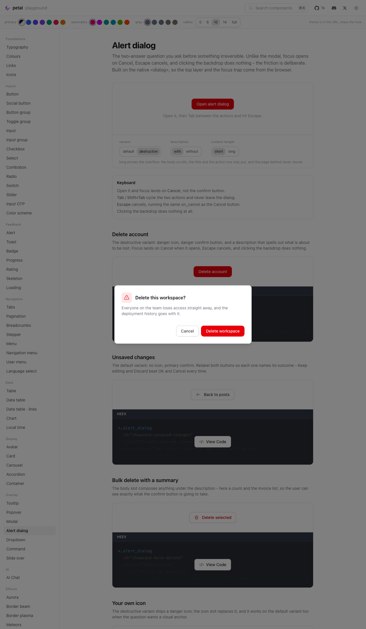
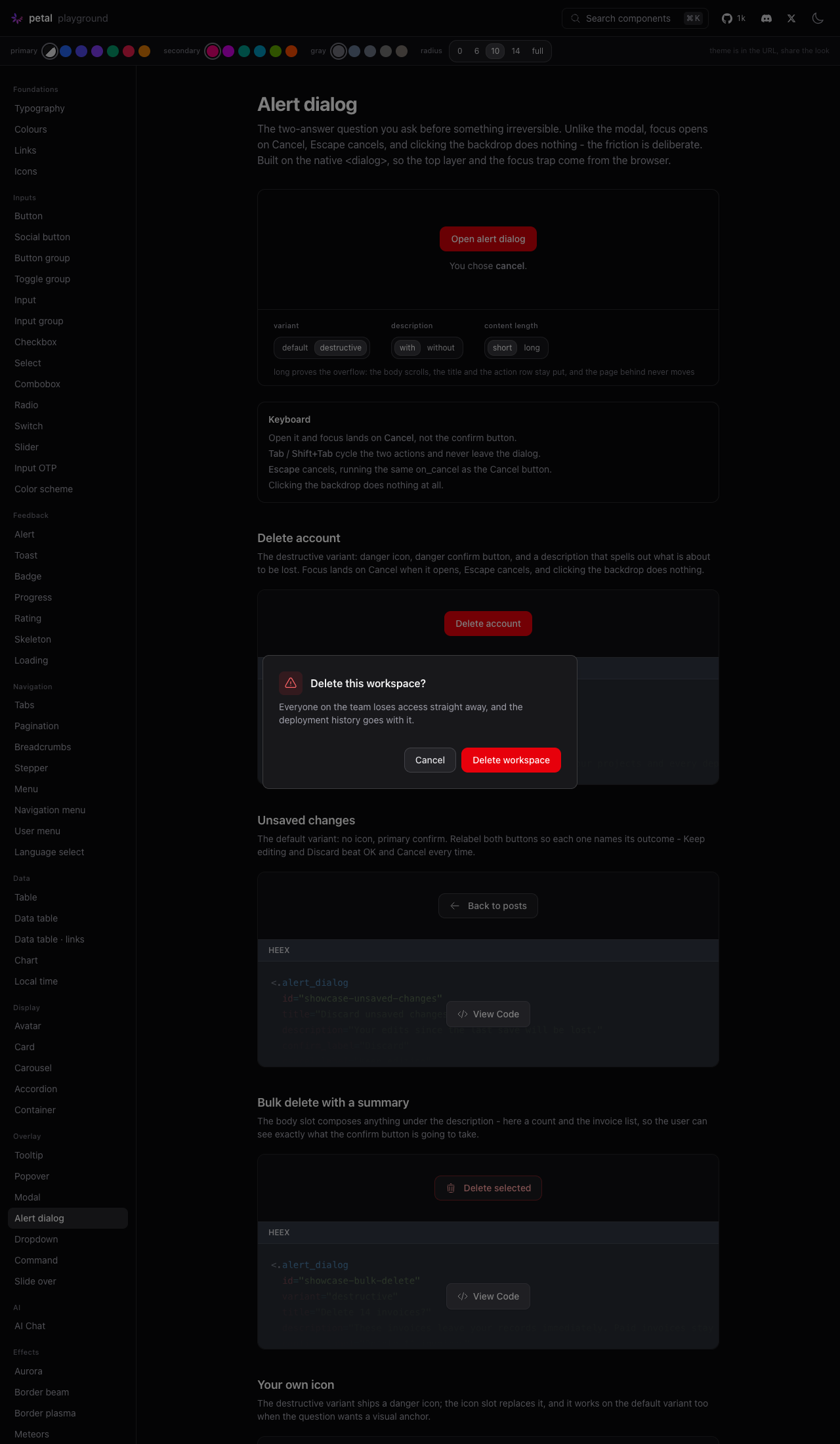
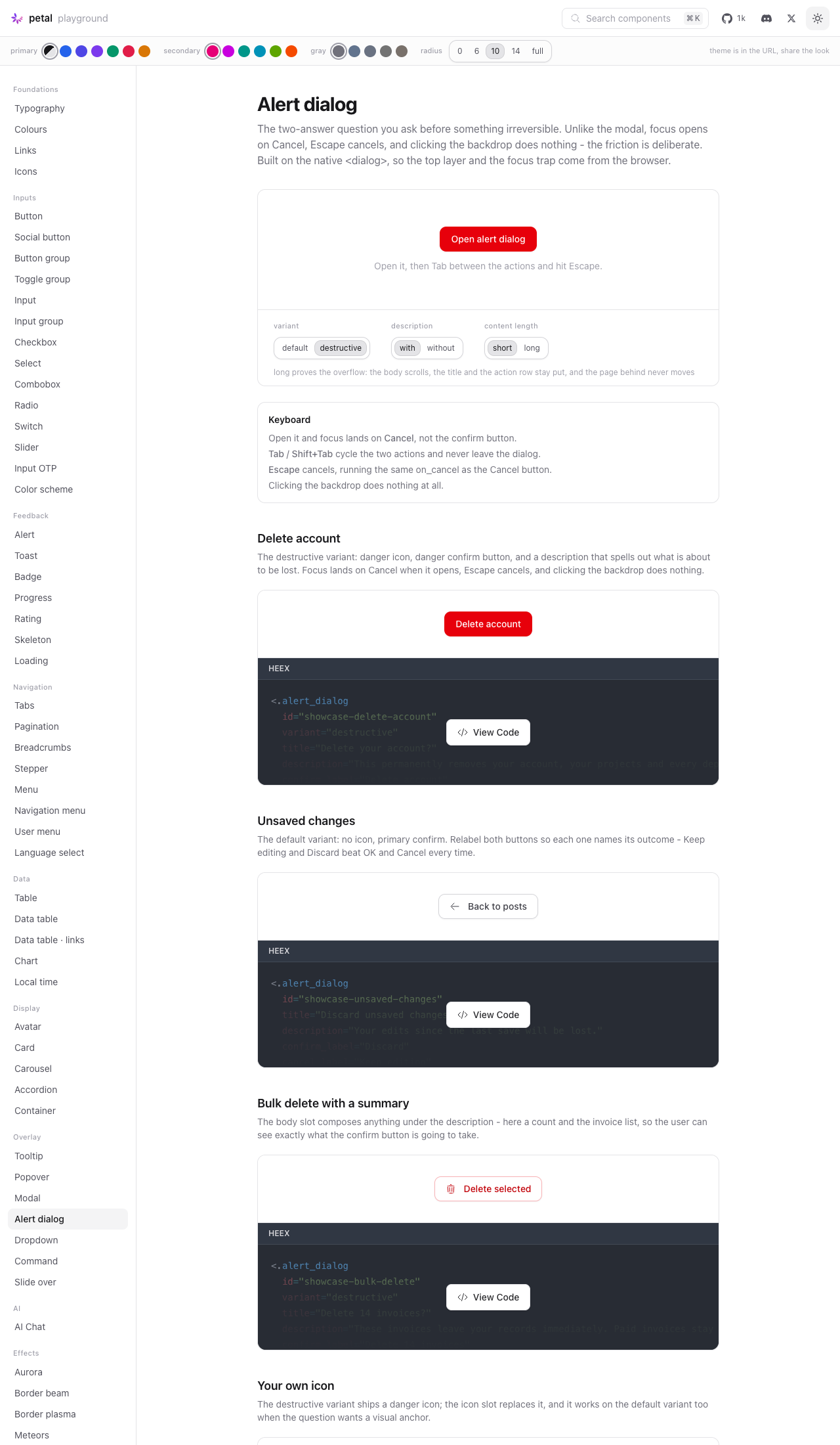
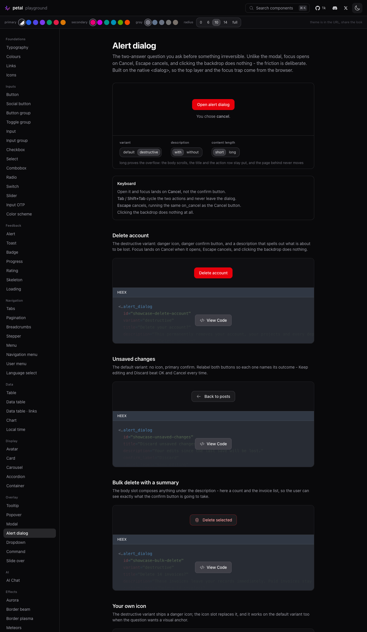

…t, live-assign proof

Audit round. (1) The brief's 'page behind does not scroll' was claimed
by the playground caption but never implemented - the hook now locks
body scroll on open and unlocks in the native close event, the one
funnel every close path drains through; destroyed() also unlocks so a
patch removing an OPEN dialog can't leave the page frozen. All three
paths spec-pinned. (2) Chrome's close watcher lets a second rapid
Escape bypass the cancelable cancel event entirely - the dialog closed
natively and on_cancel silently never ran. A close the hook didn't
initiate now routes through the cancel button, spec-pinned. (3) The
icon span took the utilities-layer heroicon sizing bug (24px icons in
real apps) - doubled-selector + bang per the house contract. (4) The
action buttons carried the raw radius token, out-rounding their own
panel at large radii - they now derive from the panel's clamped radius
like modal/slideover actions. (5) The trigger wrapper was a block div
that broke toolbar placement - display:contents keeps bubbling intact.
(6) The dark icon wash rode a white mix; it now rides the gray ramp so
a re-themed gray dial carries it. (7) The brief's live-assign proof
exists now: a dev.exs-only bulk-delete example whose body counts
ticked rows from a socket assign (the showcase macro rightly forbids
interpolation, so it lives on the page). 945 Elixir + 175 JS green;
page + all four CSS markers verified served.

|
Polish pass done. One follow-up flagged outside this PR's scope: PetalCommandDialog shares the missing background scroll lock - the same body overflow-hidden treatment should mirror there (the alert dialog's landed hook-side, so the command dialog wants the same two lines + spec). Happy to do it as a tiny separate PR after this merges. |

2 participants


Closes #600
Summary
<.alert_dialog>is the two-answer question you ask before something irreversible.<.modal>is the general-purpose overlay and it lets you out cheaply, which is the wrong behaviour when the next click deletes an account, so this inverts it:role="alertdialog", focus opens on cancel, Escape cancels, backdrop clicks do nothing.What shipped:
lib/petal_components/alert_dialog.ex-alert_dialog/1plus theopen_alert_dialog/2helper, exported viause PetalComponents. Every attr carries adoc:; the moduledoc covers alert_dialog vs modal and both variants.pc-alert-dialogsection appended toassets/default.css, inside@layer components. Nothing above it moved.test/petal/alert_dialog_test.exs- 32 tests.test/js/alert_dialog.test.js- 15 tests for the two hooks.PetalComponents.Showcase.AlertDialogwith four examples, registered inshowcase/registry.ex./c/alert-dialogwith the three dials, a keyboard map, and the showcase examples.### Unreleased/#### Addedentry at the top ofCHANGELOG.md.Native
<dialog>vs the modal's overlay machineryNative
<dialog>, the same callcommand_dialog/1made. Reasoning:showModal()gives the top layer, focus containment, and focus restoration to the opener on close. The WAI-ARIA alertdialog pattern requires all three, and<.modal>does not actually contain focus today. Hand-rolling a focus trap in an overlay div would have been the largest and least reliable part of this component.closedby="any", which this component simply never sets. So "click-away does not close" is the default rather than something fought for. The only native behaviour intercepted is Escape, and only so it runs youron_cancelrather than closing silently.::backdropreplaces the overlay div and thebody { overflow: hidden }juggling entirely.Focus, Escape and backdrop
autofocus(whichshowModal()honours) and the hook focuses it explicitly on open, so the least destructive action is the default however a consumer's body content is composed. Cancel is also rendered before confirm, so Tab order reaches the safe action first. Focus restores to the opener via the native element.cancelevent, callspreventDefault(), and clicks the cancel button. Escape and a Cancel click therefore run the identicalon_cancelpath - one code path, not two that can drift.phx-click-away, no click handler on the dialog element, noclosedby. A test asserts the absence rather than trusting it stays absent.The hook, and why
House rule is CSS-first, so naming what forced it:
showModal()andclose()are DOM methods with noPhoenix.LiveView.JSequivalent - there is no JS command that invokes a DOM method - and the nativecancelevent has to be intercepted in JS to reroute Escape throughon_cancel. Everything else (surface, radius token, transitions,prefers-reduced-motion, dark mode) is CSS.PetalAlertDialogTriggeris a second ~10-line hook backing the:triggerslot, mirroringPetalCommandTriggerfor the same documented reason: hooks mount on dead views,phx-clickJS commands only run inside a LiveView.Both are unit-tested in
test/js/alert_dialog.test.js. No new dependencies, hex or npm.Deviations from the issue's API sketch
None on the public surface - every attr, slot, default and the
open_alert_dialog/2signature match the sketch as written.Two additions the sketch did not spell out, both internal:
pc-alert-dialog__panel,__header,__body,__content,__icon,__icon-svg,__cancel,__confirmand__triggeralongside the names the issue listed. The header/body/actions split is what keeps the title and the action row visible while a long body scrolls.data-pc-alert-dialog-close/-cancel/-confirmmarkers on the action buttons are how the hook finds them.One thing worth a maintainer's eye: the confirm and cancel buttons are
<.button>(color="danger"/"primary"andcolor="gray" variant="outline") rather than bespokepc-alert-dialogbutton styles, so they inherit the theme rail and the radius rules for free. Say the word if you would rather they were standalone.Verification
mix format --check-formattedmix compile --force --warnings-as-errorsmix credoorigin/main(diffed--all --format=oneline)mix testnpm testVerified by hand in the playground, light and dark, at
/c/alert-dialog:cancel, notconfirm.cancel, i.e. it runson_cancelrather than closing silently.focus-visiblering, and does not escape the dialog.One bug found and fixed during that pass: a percentage
max-heighton the panel resolved against the dialog'sautoheight and was ignored, so a long body overflowed and clipped its own header. Both now carry the same explicit--pc-alert-dialog-max-h.Light and dark screenshots of the playground page were captured during that pass and are available on request - I have not pushed image assets to the repo.