Conversation


<.tree> renders a nested list of maps down to arbitrary depth. Closes
the gap between menu, navigation_menu and accordion - none of which
render a hierarchy.

- recursion: tree_node/1 renders its own row and, when expanded, a
  role="group" list that calls straight back into itself, so depth is
  whatever the data has. aria-level, aria-setsize and aria-posinset are
  computed per depth and sibling group on the way down.
- two expansion models, identical markup and ARIA in both. Client-side
  by default: default_expanded seeds it, the chevron toggles
  data-expanded/aria-expanded with JS.toggle_attribute and the
  0fr -> 1fr grid trick animates the height. Server-controlled when
  :expanded is passed: the chevron pushes :on_expand with the node id in
  phx-value-id, which is what :lazy branches need.
- selection is single-select and server-owned (:selected + :select_event),
  with the aria-selected and class move applied client-side on click so
  the highlight is instant. :on_select composes user JS onto it.
- slots: :item replaces the row content and receives the node map, while
  the chevron, indent and ARIA stay with the component; :empty for no
  data; :loading for a lazy branch awaiting children.
- disabled nodes carry aria-disabled and lose the selection binding but
  stay focusable, per the APG.
- guides: an aria-hidden decorative layer, one 1px column per ancestor
  level, offset half an indent step so each line falls through its
  parent's chevron.

PetalTree hook does keyboard only. Roving tabindex is the reason it
exists - moving DOM focus between arbitrary nodes on an arrow key is
not something CSS or LiveView.JS can do. It clicks the chevron and the
label the component already wired rather than owning expansion or
selection, so a pointer user gets a working tree if it never mounts.

pc-tree CSS section appended in its own @layer components block: gray
ramp neutrals, soft primary selection, --pc-radius, focus-visible only,
reduced-motion safe. Showcase module + registry entry, and a playground
page at /c/tree with dials plus three scenarios (file explorer with a
simulated lazy fetch, an :item-slot org chart, a settings nav).

Tests: 913 -> 943 Elixir, 157 -> 181 JS. Credo unchanged vs main.

Co-Authored-By: Claude Opus 5 (1M context) <noreply@anthropic.com>

Codecov Report❌ Patch coverage is
Additional details and impacted files@@ Coverage Diff @@
## main #634 +/- ##
==========================================
+ Coverage 92.40% 92.61% +0.21%
==========================================
Files 119 121 +2
Lines 5066 5226 +160
==========================================
+ Hits 4681 4840 +159
- Misses 385 386 +1 ☔ View full report in Codecov by Harness. 🚀 New features to boost your workflow:
|


ScreenshotsBranches expanded 3-4 levels so the nesting and guide lines are actually visible. Light
Dark
Lazy branch loading
Verified independently
The guide-line approach is worth noting: a separate Every key in the map was checked against live DOM state ( @nhobes — one design opinion wanted: the guide lines are deliberately subtle ( Images live on the |
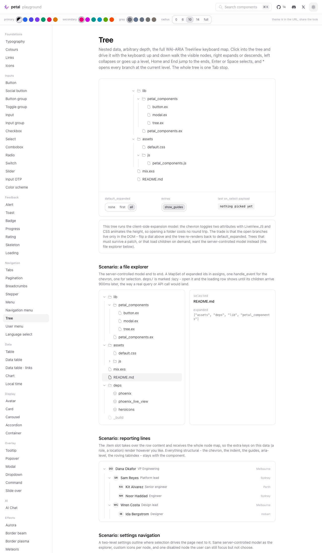
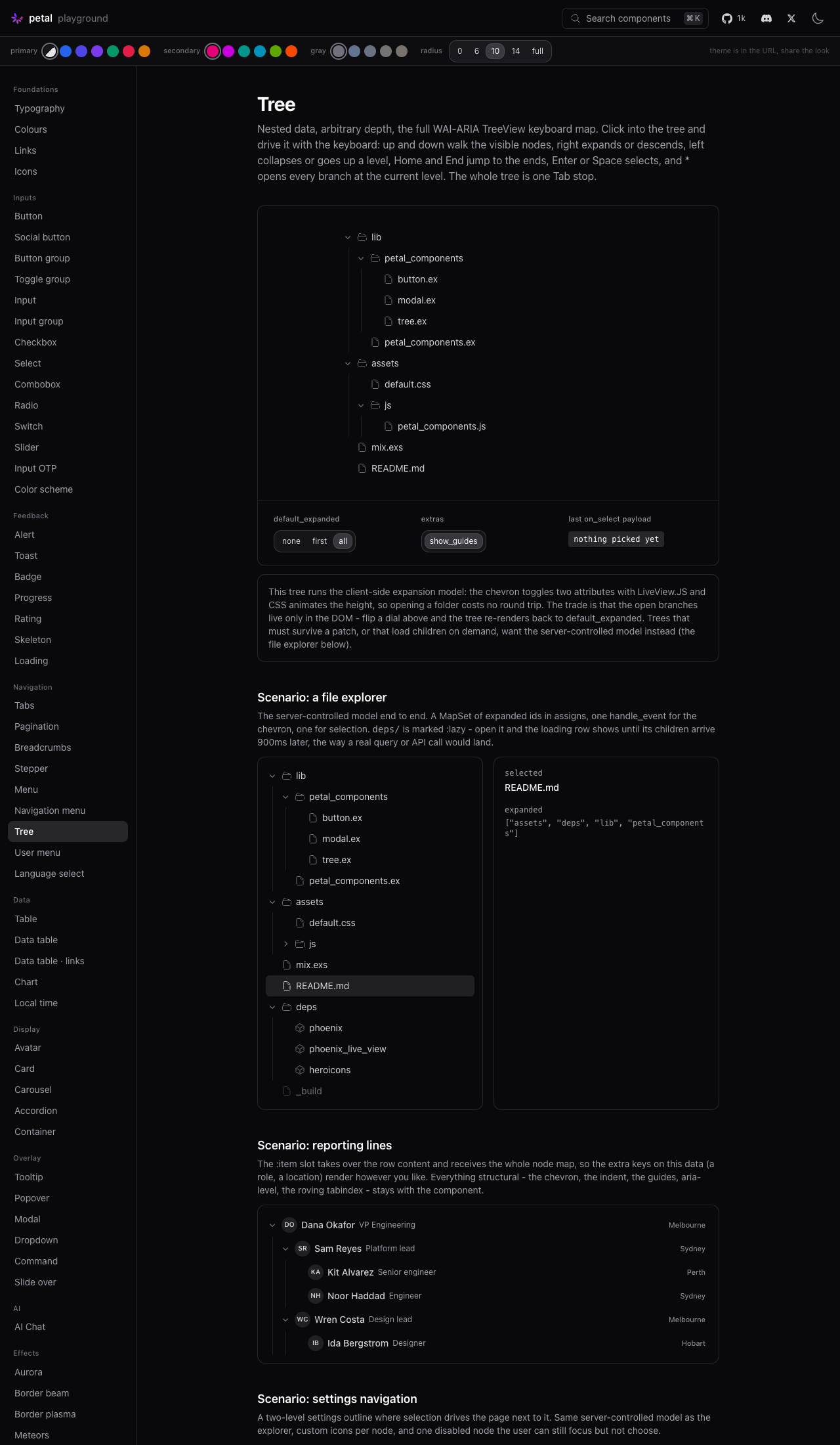
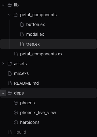

…n wired, id normalization

Audit round plus two latent bugs the new tests exposed. (1) The chevron
and node icons land on bare hero-* spans, and consumer heroicon CSS
(Tailwind v4 @plugin, every phx.new app) sizes those from the utilities
layer - beating any single components-layer selector, so tree icons
rendered 24px in real apps. Both now use the doubled-selector + bang
contract (see the pagination chevron precedent). (2) The keydown
handler intercepted MODIFIED arrows/Home/End - eating Cmd+ArrowDown
(page-end) and Ctrl+Home (document-start); the APG maps unmodified keys
only, so modifiers now bail out early, spec-pinned. (3) Selection is
now a contract you opt into: with none of selected/select_event/
on_select wired, nodes carry NO aria-selected (APG: a tree that does
not support selection must not announce it - 'not selected' on every
node of a nav tree is noise) and label clicks stop flipping a highlight
the app never asked for and cannot read. Moduledoc states the rule. (4)
NEW BUG the audit's suggested test exposed: node ids stringify
everywhere (DOM ids, phx-value-id, expanded sets) but the selected
comparison and the roving-tabindex start point compared RAW - an app
passing selected={post.id} with integer PKs never saw its highlight.
Both normalize now, test-pinned. Server-mode expanded={:all} also
pinned. 946 Elixir + 182 JS green.

…false} restores chevron-only

Only the chevron toggled a branch, so every folder in a tree had a 16px
hit target while the rest of the row did nothing (or selected, when
selection was wired). Every file tree people already use - VS Code,
Finder, the shadcn/reui trees - expands on a row click, so that is now
the default: `expand_on_click` ships true, and on a branch row a click
anywhere toggles the branch AND selects it in the same click when
selection is wired. `expand_on_click={false}` is exactly today's
behaviour, for rows whose click already has a job (a link tree that
must navigate). Leaves are untouched in both modes.

Click composition, since three handlers now share one row:

(1) The ROW carries select-then-toggle. Client-side model: the select
chain (user JS, highlight move, push) followed by the two toggle_attr
commands. Server-controlled model: the same chain followed by a
JS.push of :on_expand, which picks the node up from the row's own
phx-value-id - the chevron gets away with a bare event name only
because it is the whole handler there. A disabled branch still gets
the toggle and never the select; expansion is not selection, and its
chevron opens it today.

(2) The CHEVRON is unchanged and nested inside that row, which is
safe: LiveView resolves a click to the CLOSEST element carrying
phx-click and stops there (closestPhxBinding), so a chevron click runs
the chevron's toggle and never the row's handler underneath it. Same
rule is why the label had to give up its own phx-click - it would
otherwise swallow the row click and select without expanding.

(3) The KEYBOARD does not move. The hook selects by clicking whatever
carries data-pc-tree-select, and on an expand-on-click row every
visible element is a row click, so the select-only command moves onto
a hidden trigger inside the row: the pointer can never reach it, the
hook always can, and Enter/Space still selects without expanding.
Exactly one element per row wears the marker. Left/Right go on
clicking the chevron. The hook itself is unchanged bar a comment and a
variable name.

Row-expand also switches off when there is no expansion to take over:
server-controlled with no :on_expand has nothing to push, so the row
stays inert and the tree behaves as before.

Also: pc-tree__row--clickable for the cursor out in the indent and
trailing padding, an "expand on click" dial on the playground page so
both modes are one click apart, and the settings showcase example
(where a row click opens a page) now demonstrates expand_on_click=false.

955 Elixir + 183 JS green, format clean.

|
New commit from the omnibus eye-test: row-click expansion is now the default, matching reui/shadcn and file-explorer convention (VS Code, Finder).
Gates: |
|
Eye-test follow-up: the chevron's hover wash fused with the row hover (at depth 0 the step-wide pill was literally flush with the row's left edge — 0px gap, one L-shaped wash). New commit gives it breathing room:
|
The inset chip still read cramped: 2px side gaps against 8px vertical
is what a 20px column inside a 32px row forces on any painted box, and
no file tree convention expects one anyway - VS Code, Finder and
GitHub all highlight the row and sharpen the twisty. So the hover is
now the icon colour deepening (gray-400 -> gray-700, dark gray-500 ->
gray-200), the 24x24 invisible hit target stays, and the leaf spacer
stays inert. The chevron's job is unchanged: expand or collapse
without selecting.
|
Maintainer eye-test round 2 on the chevron: the inset chip, while better, still read cramped — 2px side gaps vs 8px vertical is what a 20px column inside a 32px row forces on any painted box. And no file-tree convention expects a box there anyway (VS Code, Finder, GitHub: row highlights, twisty glyph sharpens). New commit drops the hover box entirely — hover is now the icon colour deepening — while keeping the 24x24 invisible hit target and the one-step column geometry. The chevron's role is unchanged: expand/collapse without selecting. |
The maintainer asked where tree sits in the sidebar/menu family - the
answer deserves to live where the next asker (human or agent via the
MCP) will look. Cross-referenced against vertical_menu and sidebar the
way modal/alert_dialog and menu/sidebar already are: the shell holds
either, they never hold each other.
# Conflicts:
#	CHANGELOG.md
#	assets/default.css
#	assets/js/petal_components.js
#	dev.exs


Greptile SummaryThe PR introduces an arbitrary-depth WAI-ARIA tree component with client- and server-controlled expansion, single selection, lazy branches, styling, a keyboard-navigation hook, tests, and showcase/playground integration.
Confidence Score: 4/5The PR should not merge until expansion and selection reliably target valid public node IDs containing punctuation. The component documents arbitrary stringified unique IDs and ships dotted file IDs in its own examples, but its LiveView commands reinterpret those generated IDs as unescaped CSS selectors, preventing the intended node from being expanded or selected. Files Needing Attention: lib/petal_components/tree.ex
|
| Filename | Overview |
|---|---|
| lib/petal_components/tree.ex | Adds the recursive public tree component and its event commands, but raw IDs are used as CSS selectors and break interactions for supported dotted node IDs. |
| assets/js/petal_components.js | Adds PetalTree keyboard traversal, focus restoration, selection, and expansion behavior with lifecycle cleanup. |
| assets/default.css | Adds layered tree layout, state, focus, guide, animation, reduced-motion, and protected icon-sizing styles. |
| test/js/tree.test.js | Covers the hook's keyboard and roving-tabindex behavior in jsdom, though its fixture does not expose dotted IDs through the component's selector commands. |
| test/petal/tree_test.exs | Extensively covers recursive rendering, ARIA metadata, expansion models, selection, slots, lazy branches, and attributes. |
| lib/petal_components/showcase/tree.ex | Adds representative tree examples, including dotted file IDs that reveal the selector-escaping defect in the component implementation. |
Sequence Diagram
sequenceDiagram
  participant User
  participant Hook as PetalTree hook
  participant DOM as Tree DOM
  participant LV as LiveView
  User->>Hook: "Arrow key / Enter / Space / *"
  Hook->>DOM: Move roving focus
  Hook->>DOM: Click selection or expansion trigger
  alt Client-controlled expansion
    DOM->>DOM: Toggle aria-expanded and data-expanded
  else Server-controlled expansion
    DOM->>LV: Push node ID
    LV->>DOM: Patch expanded tree
    DOM->>Hook: updated()
    Hook->>DOM: Restore active tabindex
  end
Reviews (1): Last reviewed commit: "Merge remote-tracking branch 'origin/mai..." | Re-trigger Greptile
![greptile-apps[bot]](https://avatars.githubusercontent.com/in/867647?s=60&v=4)
|
|
||
| defp toggle_js(ctx, node_id) do | ||
| selector = "#" <> node_dom_id(ctx.id, node_id) | ||
|
|

There was a problem hiding this comment.

When a node ID contains CSS-significant punctuation such as the shipped mix.exs and button.ex IDs, toggle_js/2 and selection_js/2 interpolate it into an unescaped CSS selector. The browser interprets the punctuation as selector syntax instead of part of the ID, so expansion or selection fails to update the intended node and can target another matching element.
Knowledge Base Used: Browser hooks
2 participants


Closes #611
Summary
<.tree>renders a nested list of maps to arbitrary depth: expand/collapse, single selection, connecting indent guides, and the WAI-ARIA TreeView pattern in full. Five parts per CONTRIBUTING.md, plus aPetalTreehook and a### Unreleasedchangelog entry.lib/petal_components/tree.ex, exported fromlib/petal_components.ex(treewas free). Every attr has adoc:; the moduledoc carries the node-map reference, both expansion models, the keyboard table and usage examples.pc-treesection appended toassets/default.cssin its own@layer componentsblock, nothing reflowed.--pc-radiuswith the nested-child formula, gray ramp neutrals,dark:pairs, soft primary selection,focus-visibleonly, reduced-motion safe.test/petal/tree_test.exs(30 specs) andtest/js/tree.test.js(24 specs, vitest + jsdom).lib/petal_components/showcase/tree.explus its registry entry.tree, dials plus three scenarios at/c/tree. Verified rendering.How recursion is handled
A private
tree_node/1function component renders its own row and, when it is an expanded branch, arole="group"list that calls straight back intotree_node/1. Depth is whatever the data has - no level cap, no per-level code.Shared context (the expanded set, selection, the slots, the tree id, guides on/off) is bundled into one
ctxmap built once intree/1and threaded down, so a node carries only what is genuinely per-node: the node map, its level, and its position in its sibling group.aria-level,aria-setsizeandaria-posinsetfall out of that on the way down.Indentation is one custom property per row (
--pc-tree-depth) times a fixed step. The guides are a separatearia-hiddenabsolutely-positioned layer holding one 1px column per ancestor level, offset half a step so each line falls through its parent's chevron - which is why they line up at any depth without per-level rules.Both expansion models
Both render identical markup and identical ARIA; only the chevron's
phx-clickdiffers.Client-side (default).
default_expandedseeds it; the chevron togglesdata-expandedandaria-expandedwithJS.toggle_attribute, and the0fr -> 1frgrid technique animates the height.visibilityrides along on that transition so a collapsed branch leaves the accessibility tree rather than sitting there clipped but exposed. No round-trips.Server-controlled. Passing
:expandedswitches modes: the chevron pushes:on_expandwith the node id inphx-value-id. Required for:lazybranches, whose children only exist once the server has been asked, and for trees that must survive a patch.The moduledoc states the trade plainly, including that client-side state is lost on a patch. I deliberately did not reach for
phx-update="ignore"(the accordion's approach): the issue's own wording describes the state as "lost on patch unless the server mirrors it", and ignoring updates would break any tree whose data changes.Roving tabindex, and why there is a hook
The APG allows either roving tabindex or
aria-activedescendant; I went with roving tabindex, which the issue names as the recommended default for tree views.PetalCommandusesaria-activedescendantbecause its virtual highlight lives in a listbox the user never leaves - focus stays in the text input while the highlight moves, which is the whole point of a combobox. A tree has no input. Its nodes are the interactive elements the user is on, so real DOM focus on thetreeitemis what screen readers andfocus-visibleboth expect, and it keeps "which node am I on" in one place (the document) rather than mirrored in an attribute. Exactly one node carriestabindex="0"at render - the selected node when it is reachable without expanding anything, otherwise the first visible node - so the tree is one Tab stop.The hook is justified by exactly that. Moving DOM focus between arbitrary nodes on an arrow key is not something CSS or
Phoenix.LiveView.JScan do:JS.focus/2cannot pick "the next node that is visible given which ancestors happen to be expanded". SoPetalTreedoes the keyboard map and the tabindex bookkeeping, and nothing else - to expand or select it clicks the chevron or the label the component already wired. Consequences:updated(), since a server patch re-renderstabindexfrom the server's guess, and hands it back to the first visible node if the branch above it closed underneath.Keyboard map implemented: Down/Up through visible nodes, Right to expand a collapsed branch or descend into an open one, Left to collapse or ascend, Home/End, Enter/Space to select,
*to expand the focused node's sibling branches. Typeahead is out, per the issue's non-goals.Deviations from the issue's API sketch
All small, all deliberate:
select_eventadded. The sketch hason_select(aJSstruct) and says the node "also emits a phx-click style event carrying the node id", but names no attr for it.select_eventis that name; the id rides inphx-value-idas the test checklist specifies.on_selectstill composes user JS onto the built-in selection behaviour, exactly as sketched.expandedandon_expandadded. The "Expansion model" section requires both but does not list them as attrs.:expandedbeing non-nil is what switches the tree to the server-controlled model.labeladded. The issue asked for "an:aria_label-friendly path viarestor a dedicated attr".labelsetsaria-label;reststill works if you preferaria-labelledby.targetadded.phx-target, so a tree inside a LiveComponent can route its events.aria-selectedand the selected class on click before the server replies, so the highlight is not a round-trip behind. Not in the sketch; it makes selection feel native and degrades cleanly.<span>, not a<button>. A button inside the tree would be a second Tab stop and break the one-Tab-stop requirement. It isaria-hidden, and keyboard users reach expansion through Left/Right per the APG. Chevron and label are siblings inside the row, so a chevron click never bubbles into selection.aria-labelledbyon eachtreeitem, pointing at its own label span. Without it, a branch's accessible name is computed from its entire subtree.show_guidestoggles them and they arearia-hidden.No new dependencies
None added, npm or hex.
Test counts
origin/main@ 871b2cf)mix testnpm testmix format --check-formattedclean,mix compile --force --warnings-as-errorsclean, andmix credois unchanged againstorigin/main(14 refactoring opportunities, 31 readability issues on both).Verified by hand
In the playground at
/c/tree, light and dark, on the real page rather than in jsdom:*expanded the focused node's collapsed siblings and left the already-open one alone; Enter selected the focused node and cleared the previousaria-selected. Confirmed by readingtabindex/aria-expanded/aria-selectedoff the live DOM after each keystroke - including across the server round-trip in the explorer scenario, where the collapse and the selection both went throughhandle_eventand the hook put the tab stop back afterwards.:lazybranch: clickingdeps/showed the loading row, then its children landed 900ms later with their custom icons.Screenshots
Captured light and dark at 1280x2200 with branches expanded 3-4 levels deep, so the nesting and the guide lines are actually visible rather than a row of collapsed roots. Not committed to the repo (no image files, no
pr-assets) - I will attach them here before taking this out of draft.