feat(context_menu): right-click menu anchored at the pointer - #633
feat(context_menu): right-click menu anchored at the pointer#633mplatts wants to merge 2 commits into
Conversation


A net-new <.context_menu>: right-click (or long-press, or Shift+F10) a
region of the page and get a menu at the cursor. Completes the menu
family alongside <.dropdown> - same floating surface, same item
anatomy, different invocation model.

- lib/petal_components/context_menu.ex: context_menu/1 plus mirrored
  context_menu_item/1, context_menu_label/1 and
  context_menu_separator/1. Items take icons, a right-aligned kbd
  hint, variant="danger", disabled, and all four link_type values via
  Link.a. disabled on the component drops the hook so right-click
  falls through to the browser's own menu.
- assets/default.css: a pc-context-menu section composing the dropdown
  panel and item styling, --pc-radius token, gray ramp, dark: pairs,
  focus-visible highlighting, reduced-motion rest state.
- assets/js/petal_components.js: the PetalContextMenu hook. Exists for
  the one thing CSS cannot do - read cursor coordinates and clamp the
  panel inside the visual viewport. Panel is a native popover="manual"
  element so an overflow-hidden ancestor can never clip it; dismiss is
  the library's own tap-outside rule (ported from PetalDataTable) so a
  drag-to-scroll gesture is a scroll, not a dismissal.
- Roving tabindex per the WAI-ARIA menu pattern: arrows skip disabled
  items and wrap, Home/End, Enter/Space activate, Escape closes and
  restores focus, Tab leaves the widget.
- Tests: 17 component specs (every attr, variant, slot, ARIA
  attribute) and 32 vitest specs for the hook (opening, collision
  maths, keyboard model, dismiss, long press, teardown).
- Showcase module + registry entry, playground page with a disabled
  dial and two scenarios, changelog entry.

Closes #601

Co-Authored-By: Claude Opus 5 (1M context) <noreply@anthropic.com>

Codecov Report✅ All modified and coverable lines are covered by tests. Additional details and impacted files@@ Coverage Diff @@
## main #633 +/- ##
==========================================
+ Coverage 92.40% 92.49% +0.09%
==========================================
Files 119 121 +2
Lines 5066 5133 +67
==========================================
+ Hits 4681 4748 +67
Misses 385 385 ☔ View full report in Codecov by Harness. 🚀 New features to boost your workflow:
|


ScreenshotsMenu open at the pointer
At rest
Verified independently
Good instincts on two calls here. Hand-verified by the author: Escape with focus restored, click-away, Not verified: long-press on real touch hardware (unit-tested only), and iOS callout suppression is CSS-only and unverified on-device. Images live on the |
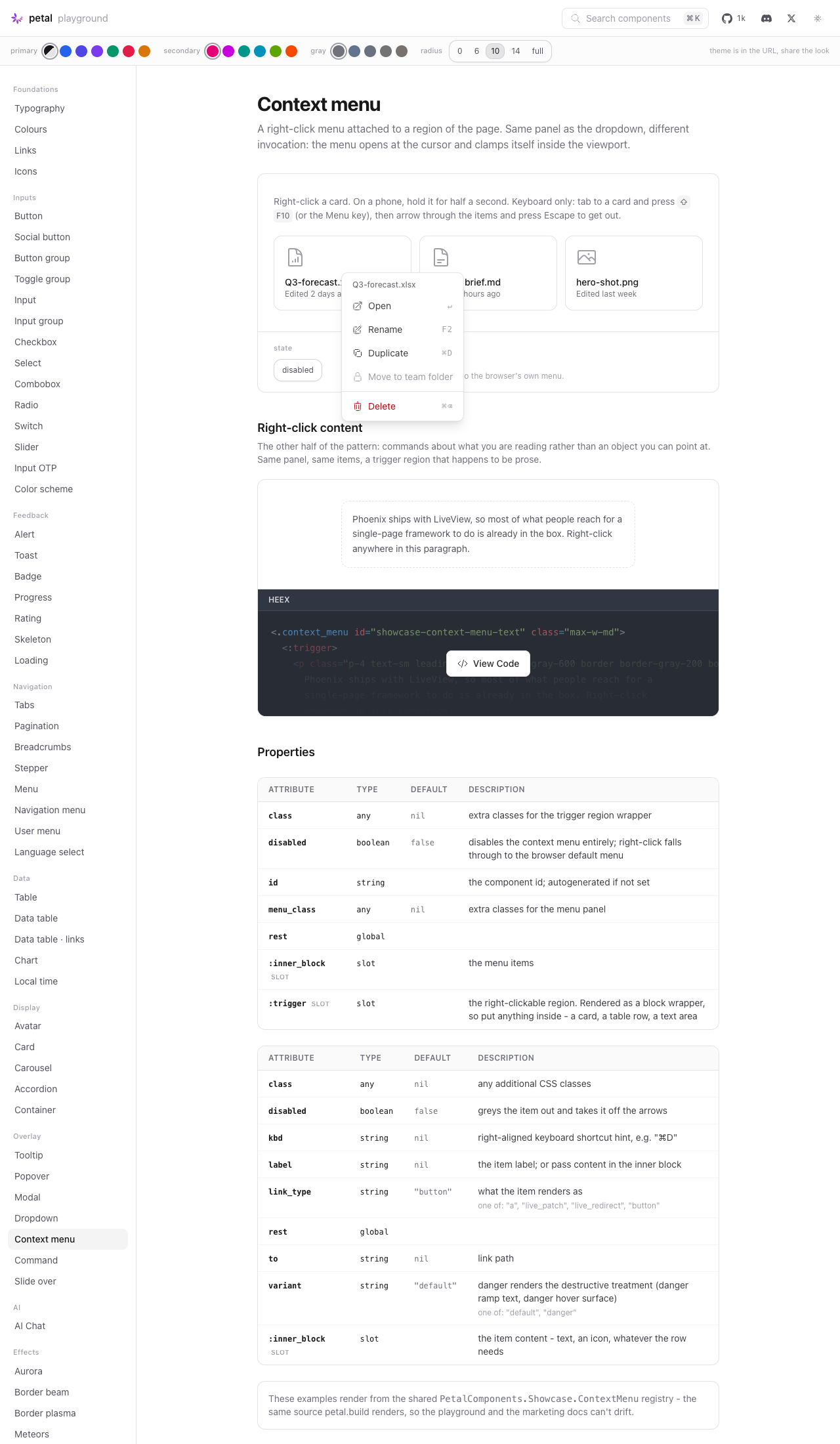
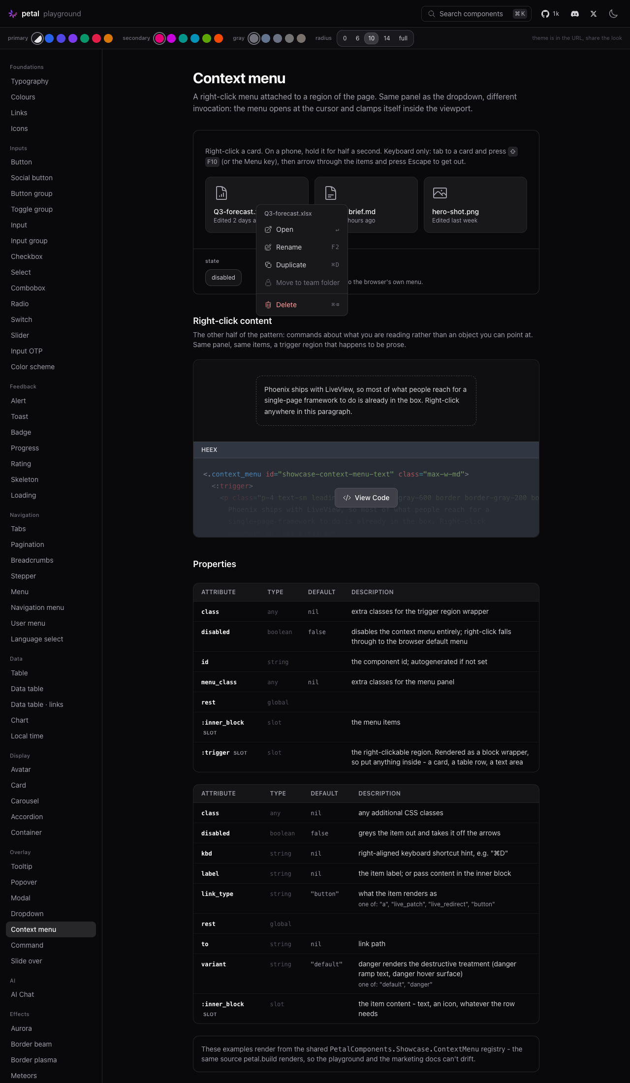
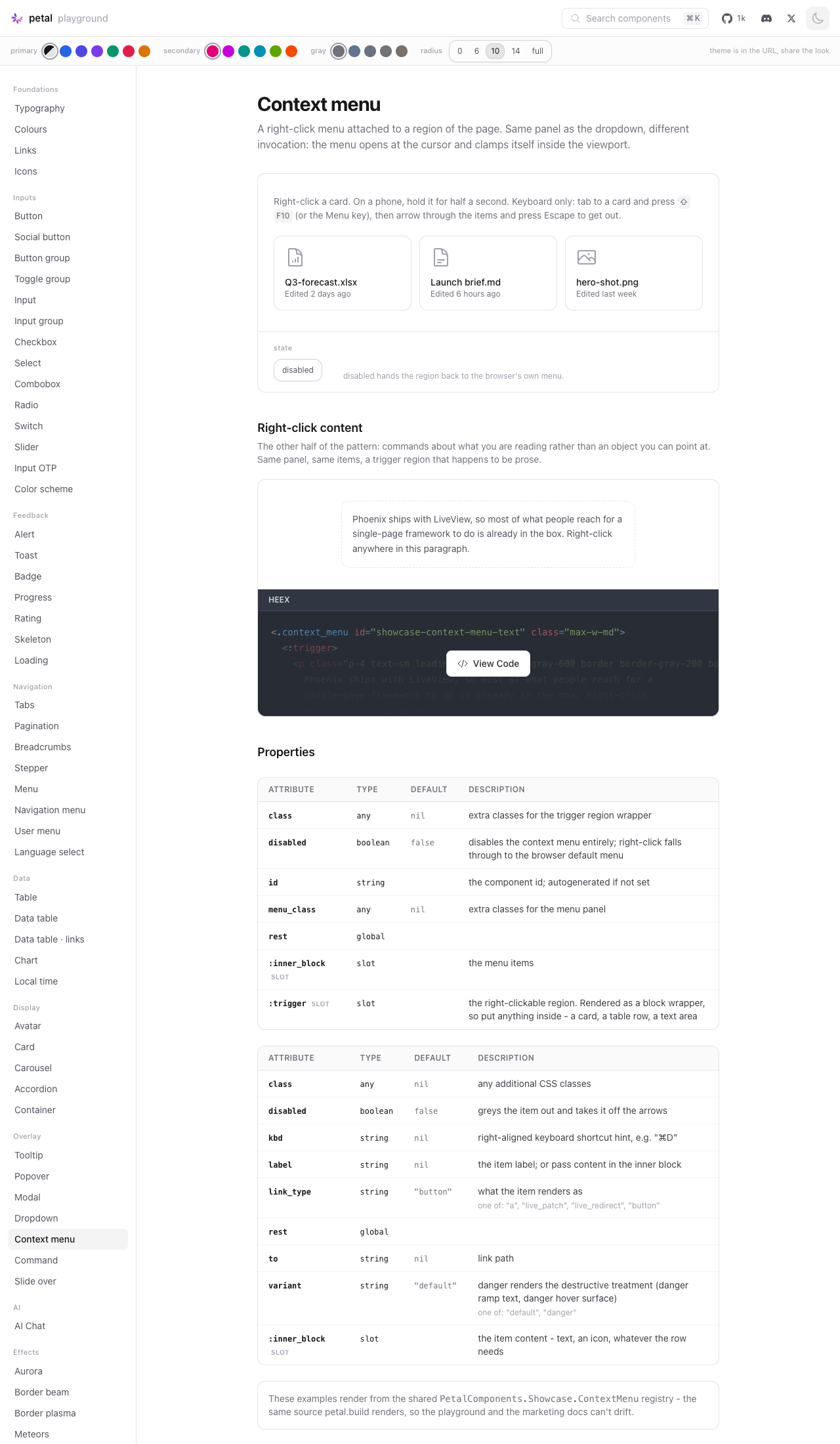
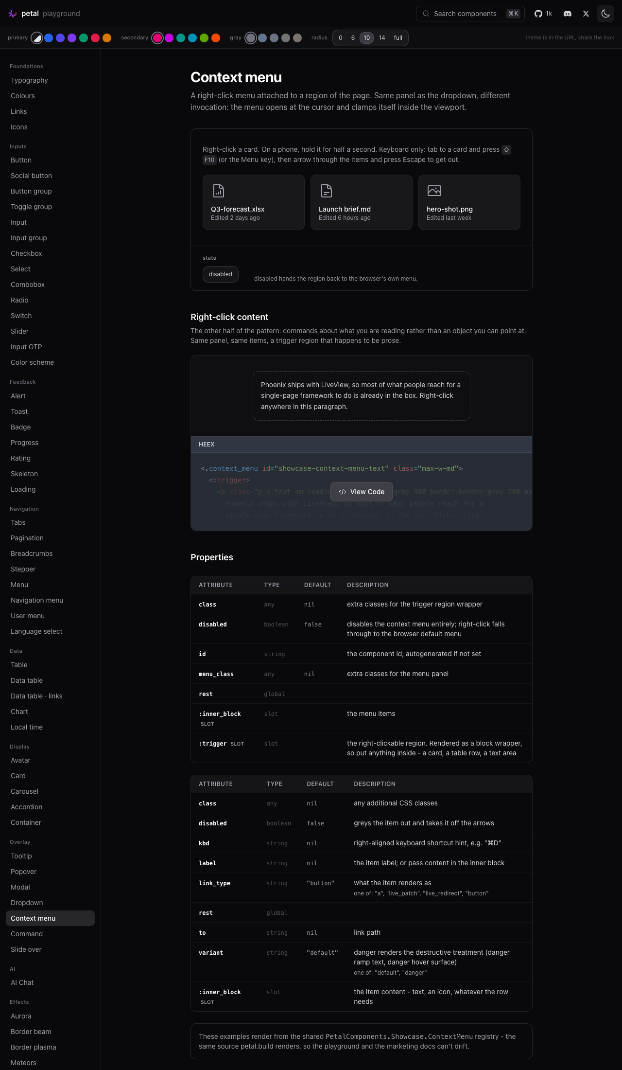

…the menu open

Audit round. (1) A disabled region still rendered tabindex=0 +
aria-haspopup/expanded/controls - a tab stop promising a menu that will
never show. All four now render only when enabled; test-pinned. (2)
updated() re-asserted only position after a patch, but a patch also
strips data-pc-open and the display fallback - in a non-popover browser
(older Safari) an open menu silently vanished on any LiveView patch.
The whole open state is re-asserted now; spec added. (3) The brief's
Enter activation rode the native click path untested - new spec pins
the full contract (key untouched, activation fires, menu closes, focus
returns to the trigger region). (4) The panel's min-w-40 vs the
dropdown surface's min-w-36 is now documented as deliberate (kbd-hint
rows need the wider floor) so the mirror claim stays honest. (5) The
playground's disabled-in-the-id interpolation gained the comment that
stops the next editor simplifying it into a broken toggle.
930 Elixir + 191 JS green.

|
Polish pass done (see the polish commit). One item deliberately left for the device eye-test: on iOS, a long-press over the prose demo can raise the text-selection magnifier alongside the menu (-webkit-touch-callout doesn't suppress selection). If it misfires on a real phone, the fix is suppressing user-select on the trigger only while the 500ms press timer is armed - never statically, or the prose demo loses its text selection. |
2 participants


Closes #601
Summary
A net-new
<.context_menu>: right-click a region of the page and get a menu at the cursor. Touch users get it from a half-second long press, keyboard users fromShift+F10or the Menu key. It completes the menu family alongside<.dropdown>- same floating surface, same item anatomy, different invocation model.Five parts, per CONTRIBUTING:
lib/petal_components/context_menu.ex-context_menu/1pluscontext_menu_item/1,context_menu_label/1,context_menu_separator/1. Every attr has adoc:; the moduledoc carries the pointer, touch and keyboard examples.pc-context-menusection appended toassets/default.cssin its own@layer componentsblock. Composes the dropdown panel and item treatment rather than forking it:--pc-radiuswith the nested-child formula on items, gray ramp neutrals,dark:pairs,focus-visibleonly, reduced-motion rest state.test/petal/context_menu_test.exs(17 specs) andtest/js/context_menu.test.js(32 specs, vitest + jsdom, modelled onpopover.test.js).lib/petal_components/showcase/context_menu.explus its registry entry.disableddial, a file-card grid and a right-click-content paragraph. Slugcontext-menu, verified rendering.Plus an
### Unreleased/#### Addedchangelog entry.Deviations from the issue's API sketch
context_menu_item/context_menu_label/context_menu_separatorrather than reusing the dropdown ones, because the items needtabindex="-1"(roving tabindex), adata-pc-context-menu-itemmarker the hook queries,aria-disabled, thekbdslot and thedangervariant - none of which belong ondropdown_menu_item. The visual treatment is not forked:pc-context-menu__itemmirrors thepc-dropdown__menu-itemdeclarations, and the panel mirrorspc-dropdown__menu-items-wrapper.classlands on the trigger region, not the outer wrapper. The outer wrapper isdisplay: contentsplumbing (it exists to host the hook and pair trigger with panel), so a class on it would do nothing. The attr doc already said "trigger region wrapper", and this makes it true.context_menu_labelgetsrole="none"and items getaria-disabled- both implied by the a11y section, neither in the sketch.Anchoring: reused, or new?
Reused, with one deliberate departure. The dismiss machinery is a direct port of the shape
PetalDataTableconverged on:onPressStart/onPressEnd/onPressCanceltracking presses perpointerId, a 10px tap slop, and multi-touch suppression - so a drag that starts on the page is a scroll, not a dismissal, and a pinch never counts. The viewport helper (visualViewportwhen present, window otherwise) and the whole-pixel write discipline come fromPetalPopover.The departure is where the panel lives.
PetalDataTable's menus are in-page and absolutely positioned so the page carries them during scroll. That is right for a panel anchored to a button, but wrong here: a context menu's anchor is a cursor coordinate, which is a client coordinate, and the trigger region is arbitrary content that frequently sits inside anoverflow: hiddencard grid or table cell. So the panel is a nativepopover="manual"element positionedfixed, which is the precedent<.popover top_layer>already sets. Consequences handled:manual, notauto: the UA's light dismiss fires on pointerdown, which is exactly the behaviour the data-table fix existed to remove.autowould also close this menu whenever any other popover on the page opened.showPopover()and the coordinate writes happen in one task, so there is no 0,0 flash to work around - nobeforetoggledance needed.Viewport collision
Default is down-and-right of the cursor, the direction every desktop OS opens one. Near an edge it flips to the other side of the cursor rather than sliding, so the pointer never lands on top of the first item (which would arm an accidental activation). After flipping, both axes clamp into the padded viewport, and the panel gets a
max-height+overflow-y: autoso a menu taller than the screen scrolls instead of running off it. All four cases have specs.Touch long-press
pointerdownwithpointerType === "touch"inside the trigger arms a 500ms timer; any movement past 10px, an early lift, or apointercanceldisarms it - so a scroll flick that starts on a card stays a scroll. On fire, the menu opens at the finger. CSS sets-webkit-touch-callout: noneon the trigger so iOS shows the menu instead of the selection loupe, andtouch-actionis deliberately left alone so the region still scrolls. Android's native long-presscontextmenuis handled by the samecontextmenupath as a right-click.Accessibility
WAI-ARIA menu pattern with roving tabindex (real focus, not
aria-activedescendant). Panelrole="menu"+aria-orientation="vertical"; itemsrole="menuitem"tabindex="-1"; separatorsrole="separator"; labelsrole="none". Keyboard-invoked opens focus the first item, pointer opens focus the panel and enter on the first arrow. Arrows skip disabled items and wrap, Home/End, Enter/Space activate, Escape closes and restores focus (withstopPropagationso a context menu inside a modal doesn't close both), Tab leaves the widget.Verified by hand in the playground: Escape dismiss with focus restored to the card, click-away dismiss, Shift+F10 open with the first item focused, arrow navigation skipping the disabled item and wrapping at both ends, Home/End.
No new dependencies
None added, npm or hex.
Test counts
origin/main@ 871b2cf)mix testnpm testmix format --check-formattedclean,mix compile --force --warnings-as-errorsclean, andmix credois unchanged againstorigin/main(14 refactoring opportunities, 31 readability issues on both).Screenshots
Light and dark, closed and with the menu open at a pointer position - attached below.