feat(kbd,separator,collapsible): micro primitives for everyday parity - #626
Conversation


Three small parts every app ends up hand-rolling, shipped together
because each is under a day of work. Pure HEEx + CSS + LiveView.JS.
No hooks, no new deps, no Alpine.

- <.kbd>: semantic <kbd> chips. Single key via the slot, or a sequence
  via keys={["cmd", "K"]} with aria-hidden separators between. A private
  symbol map folds known names (cmd, shift, alt, ctrl, enter, esc, tab,
  backspace, delete, space, the arrows, pageup/pagedown, capslock) to
  their glyph case-insensitively; anything else renders verbatim. Sizes
  sm and md. Adopts and extends the existing shared .pc-kbd rule rather
  than forking it, so the command palette trigger and input group addons
  pick up the key cap treatment (inset border, heavier bottom edge)
  without changing size.
- <.separator>: hairline divider with no margin of its own. Optional
  label via attr or slot, positioned start/center/end. Vertical mode is
  a w-px self-stretch rule. decorative defaults to true (aria-hidden, no
  role) per Radix; decorative={false} renders role="separator" plus
  aria-orientation only when vertical. Typography.hr/1 is untouched and
  stays the prose rule.
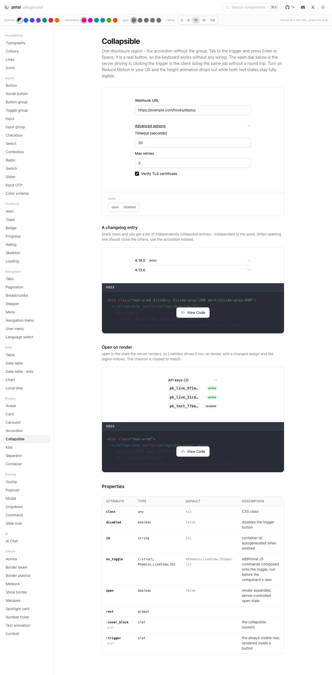
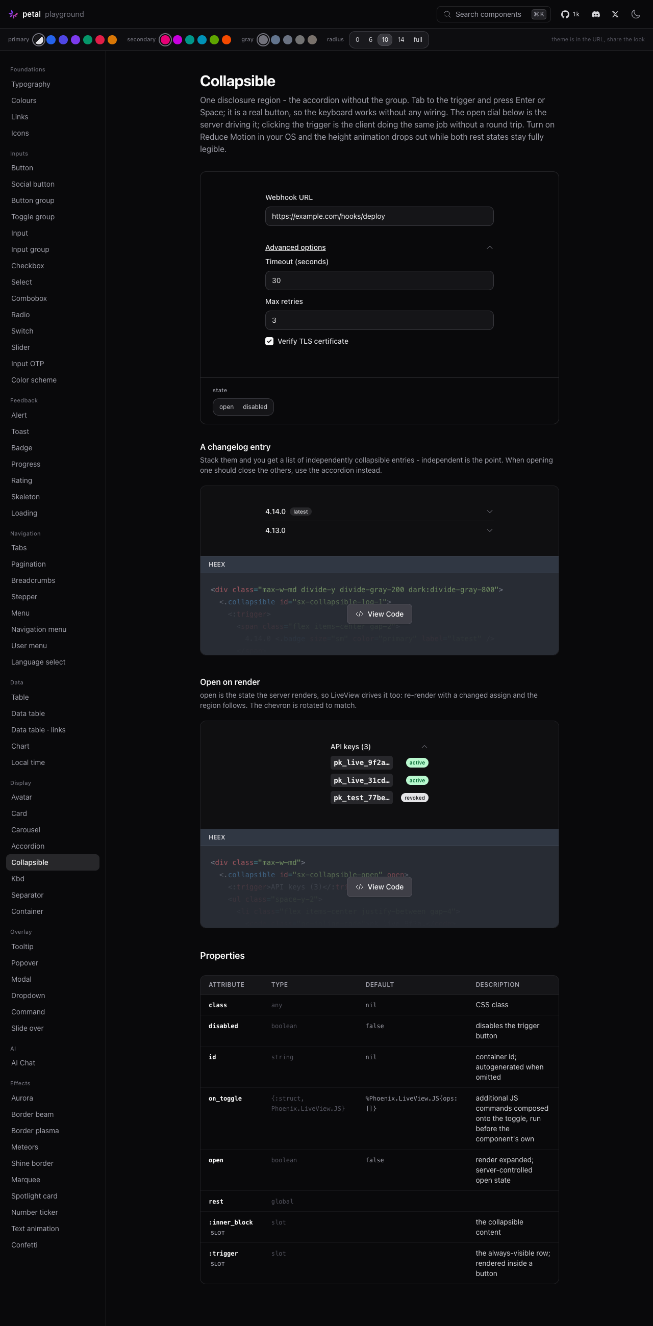
- <.collapsible>: one disclosure region, distinct from accordion. Real
  <button type="button"> trigger with aria-expanded and aria-controls,
  a role="region" panel that is inert while collapsed, chevron rotation
  synced to state, native disabled. Client toggle via LiveView.JS
  toggle_attribute/toggle_class, composed with the caller's on_toggle.
  The open attr is the server-rendered state so LiveView can drive it.
  Height animates with grid-template-rows 0fr -> 1fr and drops out under
  prefers-reduced-motion.

Showcase: 5 kbd, 6 separator, 4 collapsible examples in the shared
registry, so the playground and petal.build render the same source.
Playground: /c/primitives, one page with a section per primitive -
kbd size + separator glyph dials, separator orientation, label position
and decorative dials, collapsible open + disabled dials, plus real
product moments (shortcuts cheat sheet, menu shortcuts, OR divider,
activity feed date row, toolbar, advanced options block).

36 new component tests. 949 Elixir (was 913) / 157 JS, all green.
Live-verified in the playground: every dial, light and dark, keyboard-
only toggle of the collapsible, and the command trigger + input group
kbd addons unregressed after the shared rule change.

Co-Authored-By: Claude Opus 5 (1M context) <noreply@anthropic.com>

Codecov Report✅ All modified and coverable lines are covered by tests. Additional details and impacted files@@ Coverage Diff @@
## main #626 +/- ##
==========================================
+ Coverage 92.40% 92.61% +0.21%
==========================================
Files 119 125 +6
Lines 5066 5211 +145
==========================================
+ Hits 4681 4826 +145
Misses 385 385 ☔ View full report in Codecov by Harness. 🚀 New features to boost your workflow:
|


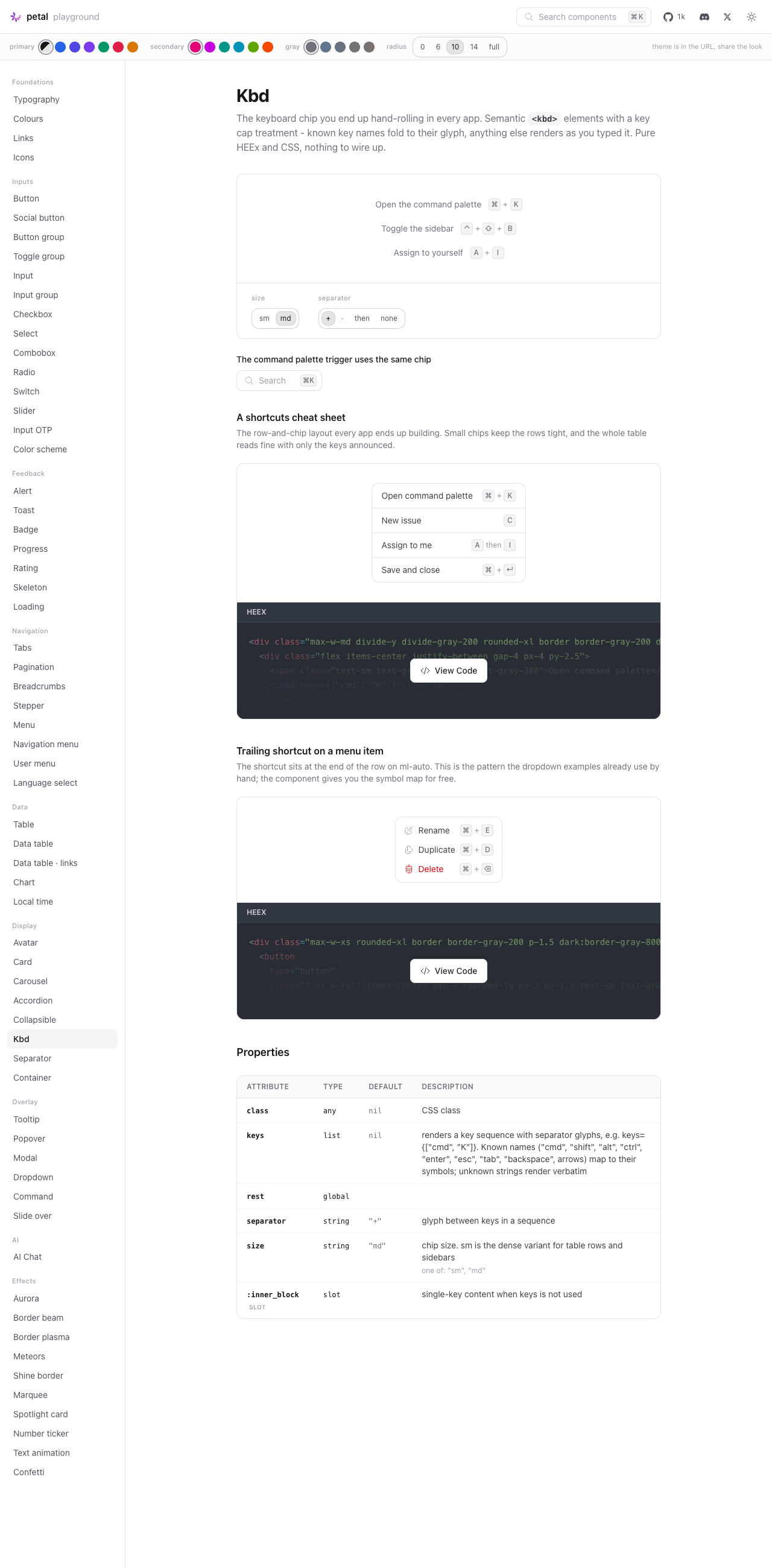
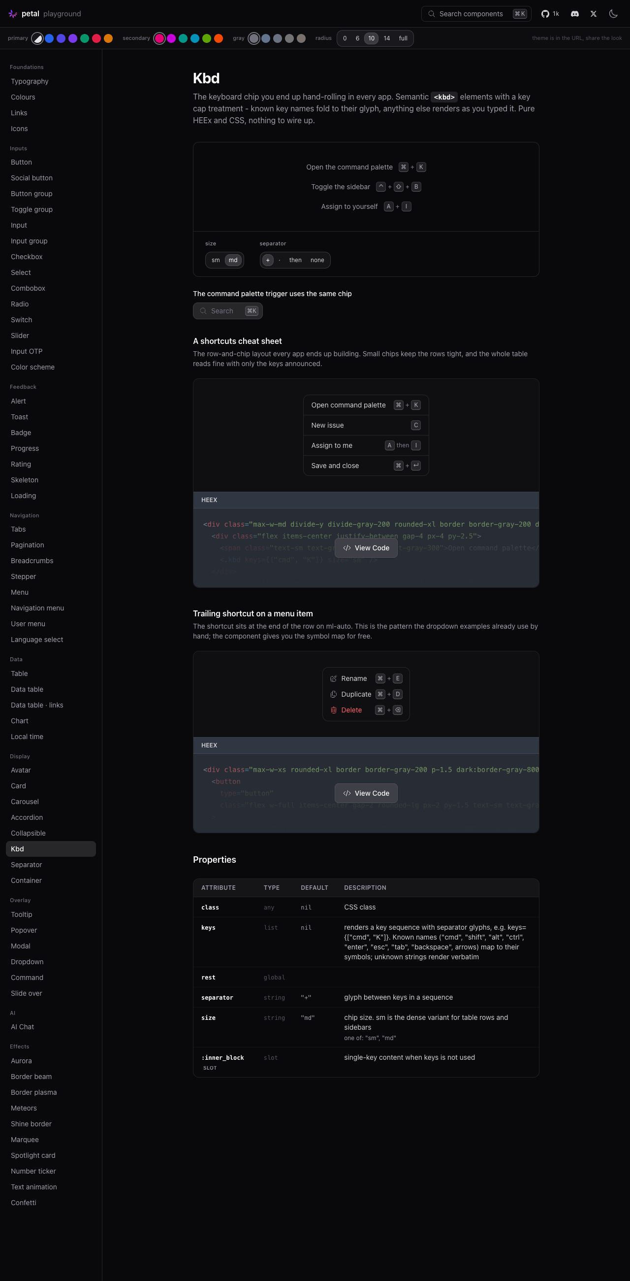
ScreenshotsAll three primitives live on one playground page, Kbd
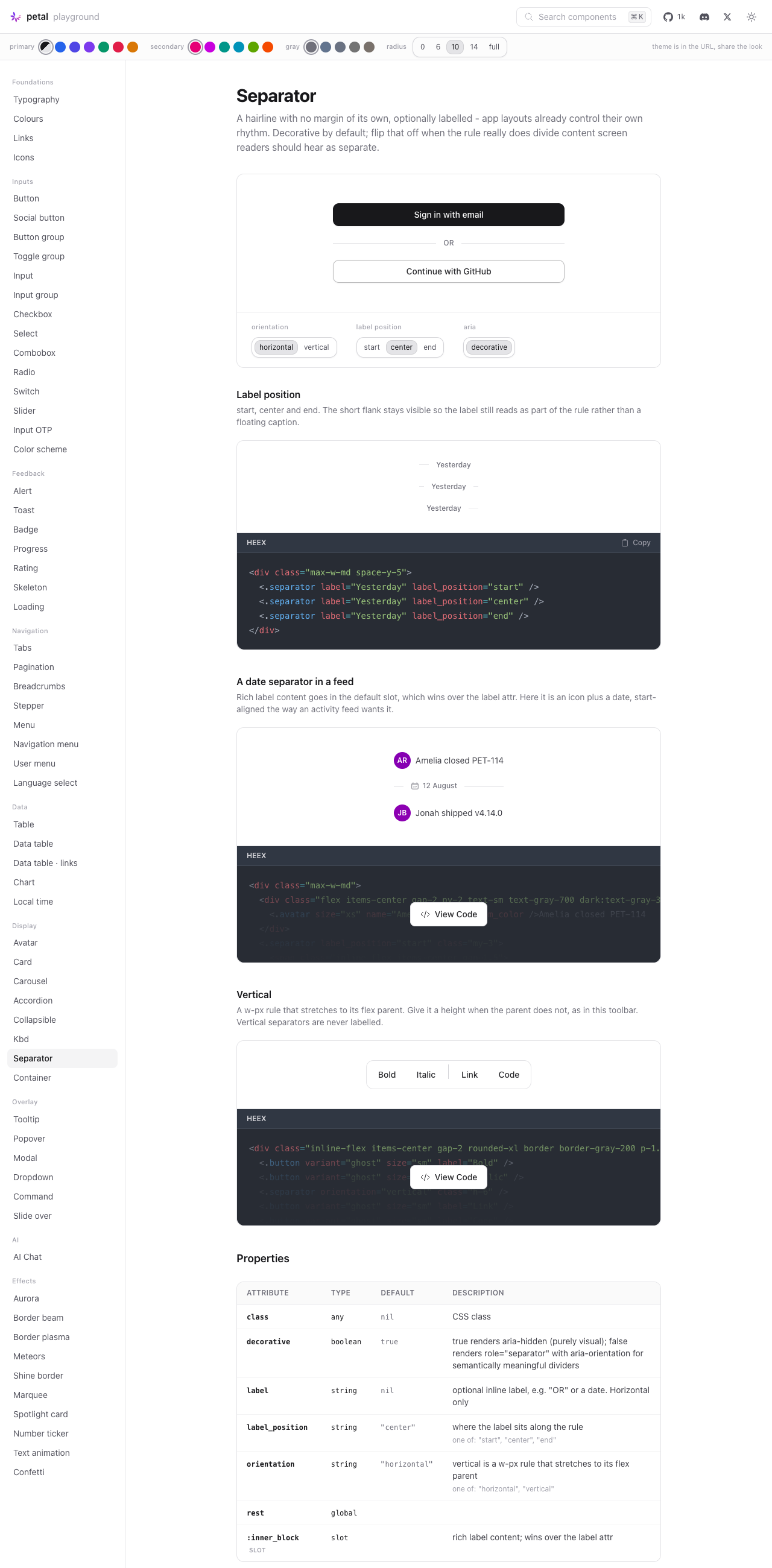
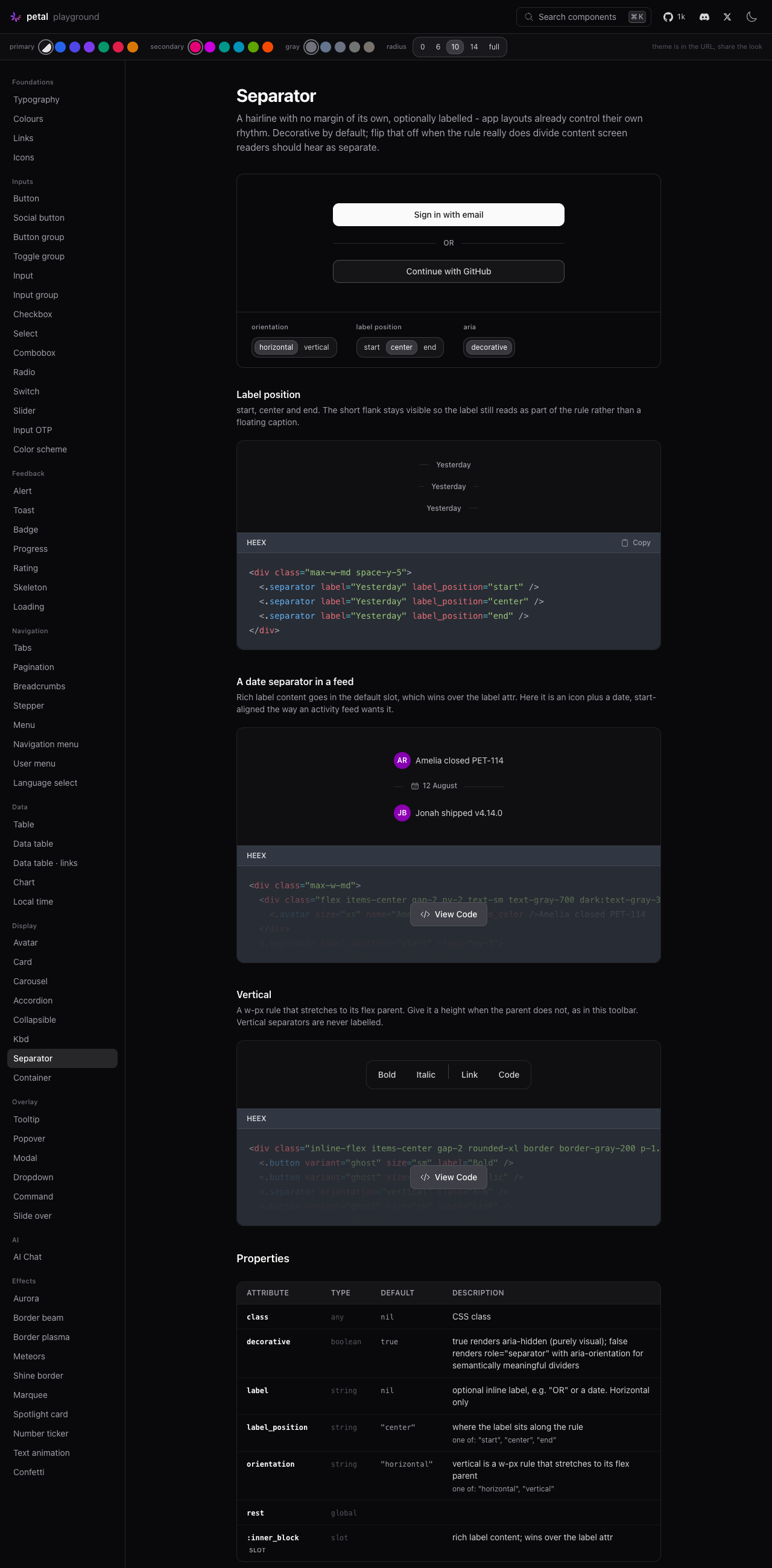
Separator
Collapsible
Two things surfaced while capturing these, both worth a decision before merge: 1. The vertical separator is faint. Two independent reviewers looked at the 2. One combined page breaks the playground's 1:1 convention. Neither is a correctness problem and both are quick to change - flagging rather than assuming. Images live on the |
gray-200 works for the horizontal separator, which sits in open layout
with a label and whitespace reinforcing it. The vertical rule is a bare
hairline wedged between toolbar buttons, where the same value reads as a
gap rather than a divider. Two independent visual reviews flagged it.

gray-300 in light, gray-700 in dark.

Co-Authored-By: Claude Opus 5 (1M context) <noreply@anthropic.com>
The playground has always been a strict 1:1 map - one nav slug per
component, one render_page clause per slug. The kbd/separator/collapsible
branch broke that by wiring all three into a single "primitives" page, so
none of them appeared in the nav by name, none could be linked to on their
own, and the showcase registry (which registers all three separately) was
about to give petal.build three doc pages against the playground's one.

Split into "kbd", "separator" and "collapsible": three nav entries in the
Display group (collapsible next to accordion), three render_page clauses,
each with its own intro, examples, dials and Properties table for just that
component. The shared @prim assign and ctl_prim handlers become per-component
@kbd / @Separator / @collapsible state with ctl_kbd / ctl_separator /
ctl_collapsible handlers, matching how every other single-component page in
dev.exs is structured. Every example and dial carries over unchanged.

Back to 63 slugs and 63 render_page clauses.

Co-Authored-By: Claude Opus 5 (1M context) <noreply@anthropic.com>
Both review points addressed1. Vertical separator darkened ( A second reviewer checked the result at 4× and made a point worth recording: the divider now sits darker than the toolbar's own container border, which is the relationship you want. At gray-200 the divider and the frame were competing at equal weight and the eye read the whole control as one undifferentiated pill. Their recommendation was to stop here rather than go louder, since a separator more prominent than the labels beside it would be worse. 2. Split into one page per component ( All three pages were confirmed to render their own component rather than the silent Verified independently
Screenshots (regenerated after the split)Kbd
SeparatorVertical rule at the new gray-300, in the
Collapsible
|

…y names, real none

Audit round. (1) A labelled separator hid its own LABEL from assistive
tech: the decorative default aria-hid the whole container (the label is
real content - only the flank lines should hide), and the semantic form
put role=separator on an element whose children that role makes
presentational, swallowing the text. Decorative+labelled now carries no
aria at all; semantic+labelled carries aria-label with the text. Both
pinned, plus the previously-untested slot-only labelled path. (2) The
exceed-shadcn move on kbd: symbol-mapped keys speak their canonical
names via aria-label (VoiceOver reads nothing for several of the bare
glyphs) - Command/Shift/Option/arrows and friends; verbatim keys stay
unlabelled. (3) The playground's 'none' separator dial was a lie: it
sent a space, which still rendered an aria-hidden whitespace span plus
the group gap. separator={nil} now renders no separator span at all,
and the dial maps through it. (4) :rest attrs in all three modules
gained doc strings for the MCP surface. 954 tests green.

|
Polish pass done. Deviations for your sign-off when reviewing (all deliberate, none blocking):
|
…the middle

Two maintainer eye-test reads. The activity-feed example start-aligned
its date label, which at feed width reads as an accident rather than a
choice - and centred is how feeds conventionally break days (the
label_positions example above still teaches start and end). The vertical
toolbar example gave the rule an explicit h-6, which defeats
self-stretch and lets flexbox park it at the TOP of the row - it now
pairs the height with self-center, and both the example description and
the moduledoc spell out the trap.
…llapsible

# Conflicts:
#	CHANGELOG.md
#	assets/default.css
#	dev.exs


Greptile SummaryThe PR adds public keyboard-chip, separator, and collapsible primitives, along with shared styling, documentation, tests, and playground examples. It also exposes the components through the main import surface.
Confidence Score: 3/5The PR should not merge until collapsibles retain stable identity across LiveView patches and semantic rich-slot separators receive the correct accessible name. Omitted collapsible IDs are regenerated during rerenders, which can discard client-local disclosure state, while semantic separators can expose an accessible name that differs from or omits their rendered slot label; the chevron cascade issue is visual and non-blocking. Files Needing Attention: lib/petal_components/collapsible.ex, lib/petal_components/separator.ex, assets/default.css
|
| Filename | Overview |
|---|---|
| lib/petal_components/collapsible.ex | Adds the disclosure API and synchronized DOM toggles, but autogenerated IDs are unstable across LiveView rerenders and can reset client state. |
| lib/petal_components/separator.ex | Adds flexible visual and semantic separators, but semantic rich-slot labels can receive a missing or stale accessible name. |
| lib/petal_components/kbd.ex | Adds semantic key and shortcut-sequence rendering with normalized glyphs and accessible names; no actionable defect identified. |
| assets/default.css | Adds styles for all three primitives, with a non-blocking cascade weakness in the collapsible chevron sizing rule. |
| lib/petal_components.ex | Exposes all three new components through the intended public import boundary. |
| dev.exs | Adds playground navigation, controls, and examples for the new primitives. |
| test/petal/collapsible_test.exs | Covers static markup and encoded toggle commands but does not exercise an omitted-id disclosure across LiveView patches. |
| test/petal/separator_test.exs | Covers semantic labels and rich slots independently but misses their problematic combined path. |
| test/petal/kbd_test.exs | Thoroughly covers rendering variants, symbol mapping, separators, passthrough attributes, and accessible names. |
Flowchart
%%{init: {'theme': 'neutral'}}%%
flowchart LR
  A[Server render: open attr] --> B[Collapsible DOM state]
  C[Trigger click] --> D[LiveView.JS toggles attributes]
  D --> B
  B --> E[data-state drives panel animation]
  B --> F[aria-expanded describes trigger state]
  B --> G[inert controls content accessibility]
  H[Later LiveView patch] --> A
Reviews (1): Last reviewed commit: "Merge remote-tracking branch 'origin/mai..." | Re-trigger Greptile
![greptile-apps[bot]](https://avatars.githubusercontent.com/in/867647?s=60&v=4)
| # the value, not the key. | ||
| assigns = if assigns.id, do: assigns, else: assign(assigns, :id, uniq_id("collapsible")) | ||
|
|
||
| ~H""" |

There was a problem hiding this comment.

When a LiveView rerenders a collapsible without an explicit id, uniq_id/1 assigns a new root, trigger, and content identity, causing client-selected open state to reset and external toggle commands holding the former ID to target elements that no longer exist.
Knowledge Base Used: Component runtime and assets
| # role="separator" swallows; rich slot content should pass the label attr | ||
| # alongside for this reason. | ||
| defp labelled_aria(true, _label), do: %{} | ||
| defp labelled_aria(false, label), do: %{role: "separator", "aria-label": label} |
There was a problem hiding this comment.
When decorative={false} is combined with slot-only content or a slot that overrides label, the visible text comes from the slot while aria-label still comes from @label, causing assistive technology to announce an unnamed or stale separator label.
Knowledge Base Used: Layout, navigation, and content primitives
| .pc-collapsible__chevron.pc-collapsible__chevron { | ||
| width: 1rem; | ||
| height: 1rem; | ||
| } |
There was a problem hiding this comment.

In Tailwind v4 consumers where Heroicons styles are emitted in the utilities layer or unlayered CSS, these ordinary width and height declarations lose the cascade, leaving the collapsible chevron oversized or misaligned instead of preserving its intended 1rem geometry.
| .pc-collapsible__chevron.pc-collapsible__chevron { | |
| width: 1rem; | |
| height: 1rem; | |
| } | |
| .pc-collapsible__chevron.pc-collapsible__chevron { | |
| width: 1rem !important; | |
| height: 1rem !important; | |
| } |
Knowledge Base Used:
Note: If this suggestion doesn't match your team's coding style, reply to this and let me know. I'll remember it for next time!
2 participants


Closes #604
Three micro primitives in one PR, as the issue asked:
<.kbd>,<.separator>,<.collapsible>. All pure HEEx + CSS +Phoenix.LiveView.JS. No hooks, no new dependencies, no Alpine.What shipped
<.kbd>-lib/petal_components/kbd.exSemantic
<kbd>chips. Single key through the default slot, or a sequence throughkeys={["cmd", "K"]}which renders one<kbd>per key witharia-hiddenseparator glyphs between them. A private symbol map folds known names to their glyph, case-insensitively, and anything unknown renders verbatim. Two sizes,smandmd.The existing shared
.pc-kbdrule was extended rather than forked, so the command palette trigger and input group addons pick up the key cap treatment for free. The treatment is an insetbox-shadowborder with a heavier bottom edge rather than a realborder, specifically so existing consumers get the new look without their box size changing - the palette trigger and the search field addon both sit inside tight chrome where 2px would show.<.separator>-lib/petal_components/separator.exA hairline with no margin of its own. Optional label via the attr or the slot (slot wins), positioned
start/center/endby collapsing one flank to a stub. Vertical mode is aw-px self-stretchrule; the caller sets the height.decorativedefaults totrue(aria-hidden, no role) to match Radix, anddecorative={false}rendersrole="separator"plusaria-orientation="vertical"only when vertical.Typography.hr/1is untouched. Both moduledocs now say which one to reach for.<.collapsible>-lib/petal_components/collapsible.exOne disclosure region. The trigger is a real
<button type="button">carryingaria-expandedandaria-controls; the panel isrole="region", labelled by the trigger, andinertwhile collapsed so it is out of the tab order and out of the a11y tree instead of being an invisible trap.disableduses the native attribute. Chevron rotation is synced to state on both the server render and the client toggle.Toggling is
JS.toggle_attributeondata-state/aria-expanded/inertplusJS.toggle_classon the chevron, composed with the caller'son_togglethroughcompose_js/2(user commands run first). Theopenattr is the server-rendered state, so LiveView can drive it by re-rendering.The height animation is
grid-template-rows: 0fr -> 1fron a grid wrapper with the inner row clipping, and it is dropped entirely underprefers-reduced-motion: reduce.Deviations from the issue's API sketch
Four, all small:
escmaps toEsc, not⎋. Every other name in the map folds to a glyph.⎋is obscure enough that most people read it as a rendering failure, and shadcn/reui both printEsc. Same reasoning forpageup/pagedown->PgUp/PgDn.interpolate-size: allow-keywordsprogressive enhancement on the collapsible. The issue floated it as an optional layer on top of the grid-rows baseline. Layering aheight: autotransition over agrid-template-rowstransition means two mechanisms animating the same box, and they fight on browsers that support both. The grid-rows approach already animates content of any height with nothing measured in JS, so the enhancement buys nothing and risks a double transition. Happy to add it if you disagree.toggle_collapsible/2, nottoggle/2. These modules are imported unqualified byuse PetalComponents, and exportingtoggle/1,2into every consumer's namespace is asking for a collision. The name is uglier; the collision isn't worth it.<.separator>ignoreslabelwhenorientation="vertical"rather than rendering a broken flex row. Labelled vertical separators are out of scope per the issue, so this makes the out-of-scope combination degrade to a plain vertical rule. Asserted in the tests.Implementation decisions worth a look
inerton the collapsed panel. The alternative wasdisplay: none, which cannot animate, or leaving it visible-but-clipped, which leaves focusable content reachable inside a zero-height box.inerttoggles instantly on click while the visual collapse animates, which is the right tradeoff.:idis a declared attr defaulting tonil, soassign_new/3never fires. The component tests the value instead. Worth knowing if you copy the pattern.@layer components { }. The tail ofassets/default.cssafter line ~7015 is currently unlayered, which means those rules beat consumer utilities passed throughclass. Appending the new section inside a layer keepsclassoverrides working the way callers expect. Nothing existing was reflowed. The pre-existing unlayered tail is left alone - flagging it as a separate observation, not fixing it here.open. LiveView only diffs changed dynamics, so flipping an unrelated assign will not stomp a client-side toggle. Documented in the moduledoc. It is also why the playground'sdisableddial does not close an already-open region.Playground
New nav entry under Display: Primitives (
/c/primitives). One page, a section per primitive, following the existing dial pattern.+,·,then, none). Examples: a command palette hint row, the command trigger dogfooding the same chip, a shortcuts cheat sheet, a menu with trailing shortcuts.Verification
Ran in the playground at
mix run dev.exs, both themes:kbdaddon re-checked after the shared.pc-kbdchange: both render at the same size with the new cap treatment, in light and dark.Screenshots were captured locally during the walkthrough but are not attached here - happy to drop light/dark captures in a comment if you want them on the PR before review.
Tests
mix testnpm test36 new component tests across
test/petal/kbd_test.exs,separator_test.exsandcollapsible_test.exs. Every attr, variant and slot has at least one rendering assertion, and the a11y attributes are asserted explicitly.mix format --check-formattedis clean.mix credoreports the same issues asmain(verified by stashing) - nothing new in the added files.