feat(empty): empty-state component - #624
Conversation


<.empty> is the empty-state primitive - what a list, table, inbox or
search renders when it has nothing to show. Pure markup and CSS, no JS,
no hook.

- media, title, description, actions row, trailing line; every part
  optional, centred in a column, DOM order preserved for screen readers
- four variants: default (bare centred column), compact (tighter, for
  table frames and lists), card (the panel surface, same radius formula
  as pc-card), dashed (drop-target look, visual only)
- sizes sm/md/lg scale media, type and spacing together
- default media treatment when no :icon slot - a muted circle with a
  dashed ring around hero-inbox, aria-hidden because it is decorative
- :icon slot replaces it with any icon or illustration
- root stays a plain div: no landmark, no live region. Announcing a
  changed result set belongs to whatever changed it
- drops into <.data_table>'s :empty slot, so a table's empty state and a
  page's are one component
- pc-empty CSS section in assets/default.css, light and dark

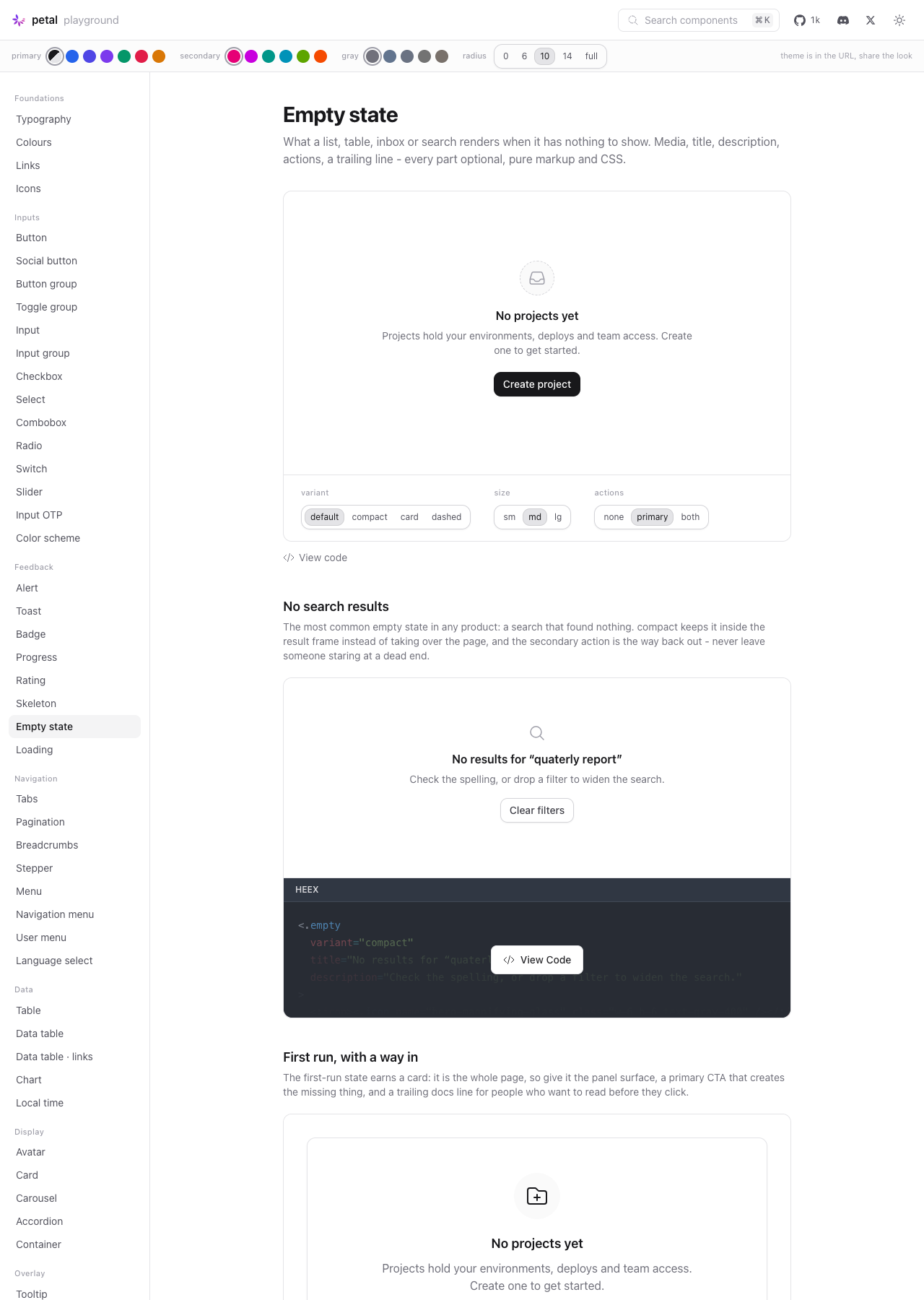
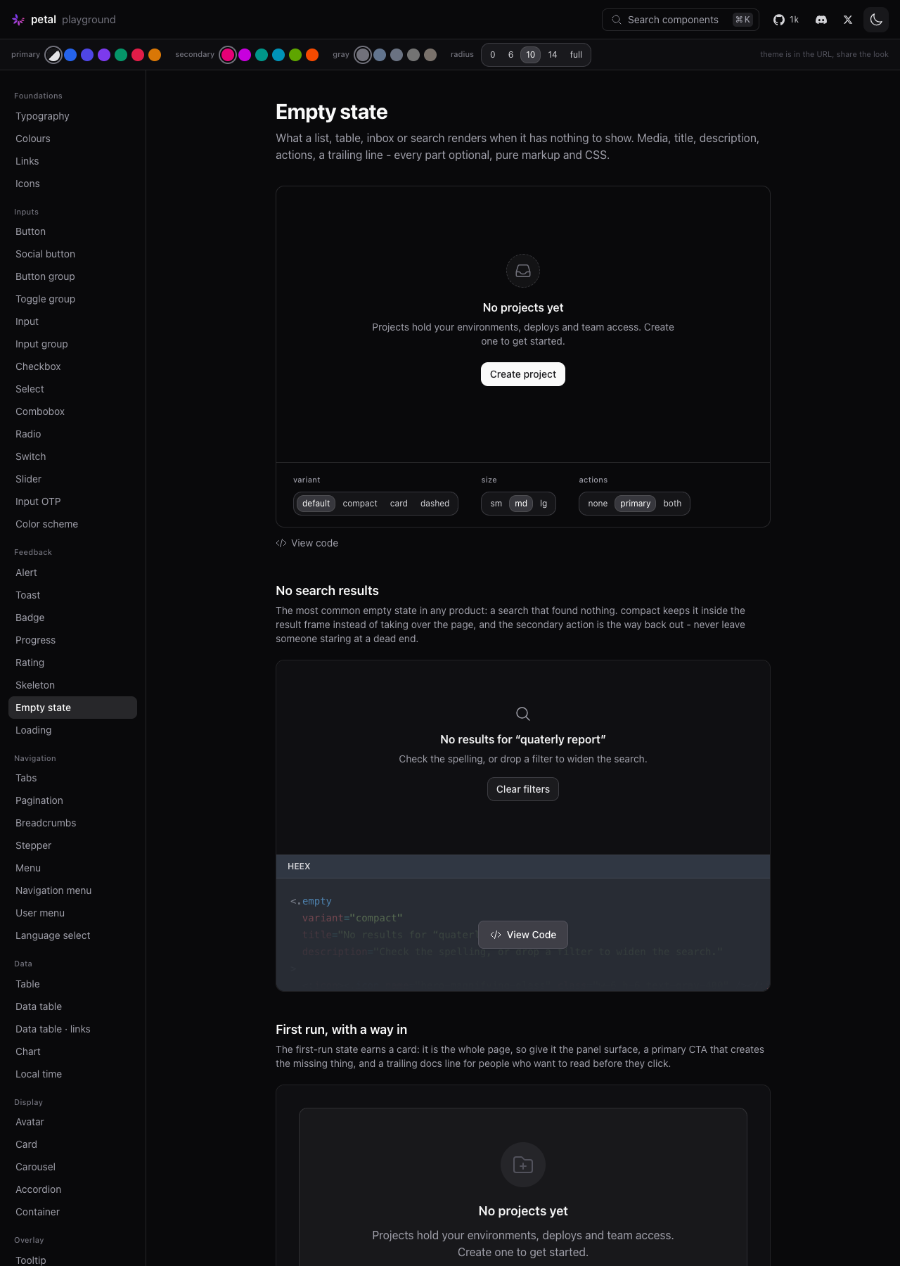
Showcase: search, first run, four treatments, inside a data table.
Playground: /c/empty with variant / size / actions dials and a live
snippet.

19 component tests. 932 Elixir (was 913), 157 JS unchanged.

Co-Authored-By: Claude Opus 5 (1M context) <noreply@anthropic.com>

Codecov Report❌ Patch coverage is
Additional details and impacted files@@ Coverage Diff @@
## main #624 +/- ##
==========================================
+ Coverage 93.43% 93.46% +0.03%
==========================================
Files 119 121 +2
Lines 5297 5339 +42
==========================================
+ Hits 4949 4990 +41
- Misses 348 349 +1 ☔ View full report in Codecov by Harness. 🚀 New features to boost your workflow:
|
Match the repo's dominant style (691 bare vs 370 parenthesised) and the
newest reference component, data_table. No behaviour change.

Co-Authored-By: Claude Opus 5 (1M context) <noreply@anthropic.com>

ScreenshotsPlayground page at Light
Dark
Images live on the |

…he aria-hidden slot

Audit round on the bulk-built PR. (1) The appended pc-empty section
landed AFTER the file's last @layer components block closed, so its
rules were unlayered - and unlayered author CSS beats every layer in
Tailwind v4, which would let .pc-empty { items-center } defeat a user's
items-start utility, breaking the pc-* override contract. Wrapped in
its own layer with a comment carrying the reason. (2) The brief's
deliberate title-is-a-p decision (empty states must not enter the
heading outline) is now test-pinned. (3) The :icon slot doc states the
media wrapper is always aria-hidden, so meaningful text goes in
title/description.
# Conflicts:
#	CHANGELOG.md
#	dev.exs


Greptile SummaryThe PR adds a public, server-rendered empty-state component with configurable variants, sizes, media, actions, and footer content.
Confidence Score: 4/5The default icon sizing should be made resilient to supported downstream Heroicon CSS before merging. The component's default glyph uses ordinary component-layer width and height declarations, so supported Tailwind v4 consumer styles can override all three size variants and visibly break the shipped default media treatment. Files Needing Attention: assets/default.css
|
| Filename | Overview |
|---|---|
| lib/petal_components/empty.ex | Defines the public empty-state API and optional slot-driven markup; the default media path exposes the new CSS icon-sizing regression. |
| assets/default.css | Adds all empty-state variants and responsive size bands, but its default Heroicon geometry is vulnerable to supported downstream cascade ordering. |
| test/petal/empty_test.exs | Covers markup, modifiers, slots, accessibility attributes, global attributes, and data-table composition, but cannot detect downstream Heroicon cascade behavior. |
| dev.exs | Adds playground navigation, controls, generated snippets, and examples for the component. |
| lib/petal_components/showcase/empty.ex | Adds representative search, first-run, variant, and data-table compositions. |
| lib/petal_components.ex | Adds the component to the intended unqualified public import surface. |
Flowchart
%%{init: {'theme': 'neutral'}}%%
flowchart LR
  Caller[HEEx caller] --> Empty[empty component]
  Empty --> Media{Custom icon supplied?}
  Media -- No --> Default[Decorative inbox media]
  Media -- Yes --> Custom[Slotted illustration]
  Empty --> Text[Title and description]
  Empty --> Actions[Actions slot]
  Empty --> Footer[Trailing content]
  Empty --> Classes[Variant and size classes]
  Classes --> CSS[Default component stylesheet]
Reviews (1): Last reviewed commit: "Merge remote-tracking branch 'origin/mai..." | Re-trigger Greptile
![greptile-apps[bot]](https://avatars.githubusercontent.com/in/867647?s=60&v=4)
| .pc-empty--sm .pc-empty__icon { | ||
| @apply w-5 h-5; |

There was a problem hiding this comment.

When a Tailwind v4 consumer emits Heroicon sizing in the utilities layer or as unlayered CSS, those rules override the ordinary component-layer dimensions for pc-empty__icon, causing the default inbox glyph to render at the wrong size inside its fixed media circle.
Knowledge Base Used:
2 participants


Closes #603
Summary
<.empty>is the empty-state primitive: what a list, table, inbox or search renders when it has nothing to show. Media, title, description, an actions row and an optional trailing line, centred in a column. Every part is optional, so a title on its own renders fine. Pure markup and CSS - no JS, no hook, no LiveView.JS.Four variants (
default,compact,card,dashed), three sizes (sm/md/lg) that scale media, type and spacing together, and a default media treatment - a muted circle with a dashed ring aroundhero-inbox,aria-hiddenbecause it is decorative - which the:iconslot replaces.It drops straight into
<.data_table>'s existing:emptyslot, so a table's empty state and a page's are the same component. No changes todata_tableitself.Files
lib/petal_components/empty.ex- the componentlib/petal_components/showcase/empty.ex- four examples (search, first run, four treatments, inside a data table)test/petal/empty_test.exs- 19 testsassets/default.css- appendedpc-emptysection, light + darkdev.exs- nav entry +/c/emptypage with variant / size / actions dials and a live snippetlib/petal_components.ex,lib/petal_components/showcase/registry.ex,CHANGELOG.mdDeviations from the issue's API sketch
None to the API. Attrs, slots, values and class names are exactly as sketched:
title,description,variant,size,class,rest, and the:icon/:actions/inner_blockslots; classes arepc-empty,pc-empty--{variant},pc-empty--{size},pc-empty__media,__title,__description,__actions,__footer.Two additions inside that shape:
pc-empty__media--defaultis a second class on the media wrapper, only when the:iconslot is empty. The circle-and-dashed-ring treatment has to be removable when a custom illustration comes in, and a modifier is cheaper than a second base class.pc-empty__iconsizes the default glyph per size band.<p>with heading styles, not anh*- as the issue argued. An empty state's outline level depends on its context, and the component cannot know it.Implementation decisions
role, noaria-liveon the root. An empty state is static content. Whatever changed the result set is what should announce the change; a live region here would double-announce inside a data table that already manages its own updates. Covered by a test.cardanddashedreuse the panel radius formula (min(calc(var(--pc-radius) * 1.2), 1.25rem)) and the same border tonespc-card--basicuses, so an empty card sits flush next to a real one at any radius setting. No new grays..pc-empty--sm .pc-empty__titleetc.) rather than per-part modifier classes - one dial on the root, and a custom:iconslot still gets scaled spacing around it without having to opt in.compactoverrides two spacing steps on top of its size band. It lives inside a table frame or a list, where page-level air reads as a gap.assets/default.css; no existing rules were touched or reflowed.Verification
mix format --check-formattedclean;mix credoreports nothing in the new files (pre-existing findings only)mix test: 932 tests, 0 failures, 1 skipped (baseline 913, +19 new)npm test: 157 passing (unchanged - no JS ships with this)/c/empty: every dial exercised, all four variants and three sizes, light and dark, plus the data_table composition rendering inside the table frameGaps
Screenshots are not attached to this PR - the light/dark verification was done in the playground but I have no way to upload images to the PR body from the CLI. Happy for them to be added on review, or say the word and I will describe each state in a comment.