This repository contains a PowerBI custom visual for SPC Charts. The visual is implemented purely within PowerBI and has no dependencies on external programs like R or Python. The visual natively supports tooltips as well as cross-plot filtering and highlighting.
The following chart types are (currently) implemented:
- Run: Run Chart
- i: Individual Measurements (AKA XmR)
- mr: Moving Range of Individual Measurements
- p: Proportions
- p': Proportions with Large-Sample Correction
- u: Rates
- u': Rates with Large-Sample Correction
- c: Counts
- xbar: Sample Means
- s: Sample SDs
- g: Number of Non-events Between Events
- t: Time Between Events
- SR: Indirectly Standardised Ratios
The most recent version of the visual can be downloaded from the 'Releases' section' and added to PowerBI using the 'Import visual from a file' option:

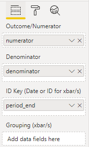
Once you have installed the visual and added it to your report, you can add the desired data (numerators, denominators, and dates) to the visual:
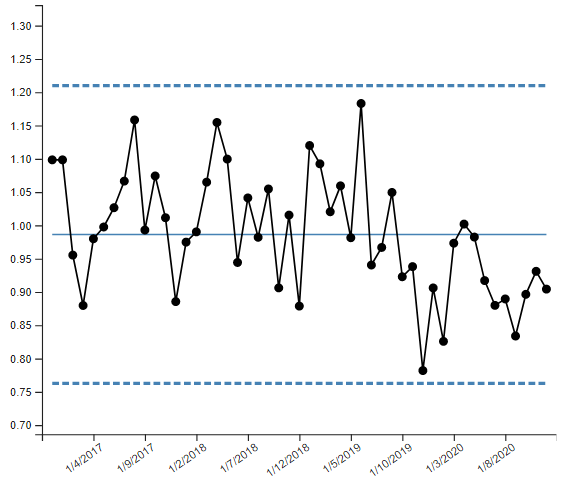
The visual will default to displaying an i-Chart:
You can change this through the 'Data Settings' menu:
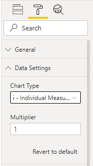
Aesthetic options for the lines, scatter dots, and chart axes are also available.
To build the PowerBI visual (.pbiviz file), you will need a working Node.js installation and internet access. Navigate to the project source directory and run:
npm install
npm install -g powerbi-visuals-tools
pbiviz package
The .pbiviz file can then be found in the dist directory