- Let's see
- The CSS Media Query gives you a way to apply CSS only when the browser and device environment matches a rule that you specify, for example "viewport is wider than 480 pixels".
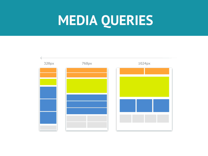
- Media queries are a key part of responsive web design, as they allow you to create different layouts depending on the size of the viewport, but they can also be used to detect other things about the environment your site is running on, for example whether the user is using a touchscreen rather than a mouse.
@media media-type and (media-feature-rule) {
  /* CSS rules go here */
}- Media type, which tells the browser what kind of media this code is for (e.g. print, or screen).
- The media expression, which is a rule, or test that must be passed for the contained CSS to be applied.
- The set of CSS rules that will be applied if the test passes and the media type is correct.
@media screen and (max-width: 768px) and (min-width: 320px) {
  body {
    background-color: red;
  }
}
This code will change the body's background color in between 320px and 768px.
- From master
$ git checkout master, create a new branch calledfeature/media-queries-Exercise. - Use your
form.htmlform the1-the-basicsfolder. - Change the body background color to match these scenarios:
- from 320 up to 600px the body color should be blue, font should be white.
- from 601 up to 1023px the body color should be green, font should be black.
- from 1024 and up the body color should be white, font should be black.
- Push the changes to your local copy of the repo (Pull request).