CSS Grid Layout is a two-dimensional layout system for the web. It lets you lay content out in rows and columns, and has many features that make building complex layouts straightforward.
Image of Grid columns and rows

A grid is a collection of horizontal and vertical lines creating a pattern against which we can line up our design elements. They help us to create designs where elements don’t jump around or change width as we move from page to page, providing greater consistency on our websites.
A grid will typically have columns, rows, and then gaps between each row and column — commonly referred to as gutters.
.grid-container {
  display: grid;
  grid-template-columns: 250px 250px 250px 250px 250px;
  grid-template-rows: 150px;
  grid-gap: 30px;
}Please complete all the levels of Grid Garden
<iframe src="https://cssgridgarden.com/" width="1024" height="768"></iframe>- From master
$ git checkout master, create a new branch calledfeature/css-grid-exercise. - Create a new html file named
grid.htmlwith a css file namedstyles.cssin4-css-gridfolder. - Create this layout using CSS grid.
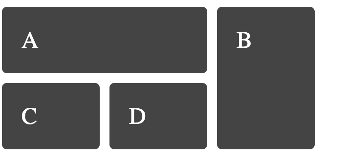
- Push the changes to your local copy of the repo (Pull request).