CSS box model is a container which contains multiple properties including borders, margin, padding and the content itself. It is used to create the design and layout of web pages. It can be used as a toolkit for customizing the layout of different elements. The web browser renders every element as a rectangular box according to the CSS box model. Box-Model has multiple properties in CSS. Some of them are given below:
- borders
- margins
- padding
- Content
Image of Box Model
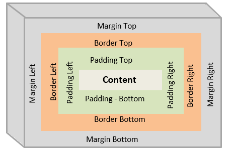
Content box: The area where your content is displayed, which can be sized using properties like width and height.Padding box: The padding sits around the content as white space; its size can be controlled using padding and related properties.Border box: The border box wraps the content and any padding. Its size and style can be controlled using border and related properties.Margin box: The margin is the outermost layer, wrapping the content, padding and border as whitespace between this box and other elements. Its size can be controlled using margin and related properties.
When you set the width of an element, the element can actually appear bigger than what you set: the element's border and padding will stretch out the element beyond the specified width. Look at the following example, where two elements with the same width value end up different sizes in the result.
.css-selector-500 {
  margin: 20px auto;
  width: 500px;
}

.css-selector-bigger {
  border-width: 10px;
  margin: 20px auto;
  padding: 50px;
  width: 500px;
}
Can you calculate the width of the css-selector-bigger element?
So you had to use some math to calculate the width of the elements, so this was considered unintuitive, that's why box-sizing property appeared, when it is applied on an element, the padding and border of that element no longer increase the width.
.css-selector-500 {
  box-sizing: border-box;
  margin: 20px auto;
  width: 500px;
}

.css-selector-bigger {
  border-width: 10px;
  box-sizing: border-box;
  margin: 20px auto;
  padding: 50px;
  width: 500px;
}
What's different?
- create a new branch from master called
feature/box-model. - Go to
3-box-modelfolder and copy the file from positioning exercise and rename it asbox-model.html. - Also copy the file
styles.css. - Inside the CSS file, set the
<section>elements to not overlap the<nav>. - Update the
<nav>styles so the 200px of width are set by padding and border, meaning you can't use thewidthproperty but the same width needs to remain. - Can you make the
<nav>links to occupy the full width of its container? - Push your changes and create the PR.
Extra: Read about display property and find out how it can affect the elements flow in the document.