


A drop-in React component that turns a
.pptxfile into a fully interactive PowerPoint: view, edit, present, collaborate, and export, entirely in the browser.
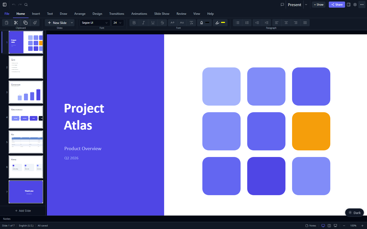
Slides render with real HTML/CSS (not <canvas>), so text stays crisp at any zoom, is selectable and screen-reader accessible, and every element is directly editable. The parsing/editing engine (pptx-viewer-core) is bundled in, so you install just one package.
▶️ Try the live demo: open a.pptxin your browser and view, edit, present, and export it. No install required.
npm install pptx-react-viewerThen add the React peer dependencies your app uses:
npm install react react-dom framer-motion lucide-react react-icons jspdf jszip fast-xml-parser i18next react-i18nextThe package is named
pptx-react-vieweron npm.pptx-viewer-core(the engine) is bundled in, so you don't install it separately unless you want to call the SDK directly. Optional:threefor 3D models/charts ·yjs y-websocketfor real-time collaboration.
import { useState } from 'react';
import { PowerPointViewer } from 'pptx-react-viewer';
// Not using Tailwind? Import the bundled stylesheet once at your app entry:
import 'pptx-react-viewer/styles';

export default function App() {
	const [content, setContent] = useState<ArrayBuffer | null>(null);

	// Load any .pptx as an ArrayBuffer (fetch, <input type="file">, drag-drop, …)
	const onPick = (e: React.ChangeEvent<HTMLInputElement>) =>
		e.target.files?.[0]?.arrayBuffer().then(setContent);

	return (
		<div style={{ height: '100vh' }}>
			{content ? (
				<PowerPointViewer content={content} canEdit />
			) : (
				<input type='file' accept='.pptx' onChange={onPick} />
			)}
		</div>
	);
}
The component fills its parent, so give the parent a height. That's the whole setup: open a file and you have a working viewer/editor.
To read the edited presentation back out as bytes, pass a ref and call getContent():
import { useRef } from 'react';
import { PowerPointViewer, type PowerPointViewerHandle } from 'pptx-react-viewer';

const viewerRef = useRef<PowerPointViewerHandle>(null);

// <PowerPointViewer ref={viewerRef} content={content} canEdit />
const bytes = await viewerRef.current?.getContent(); // Uint8Array of a valid .pptx| Feature | Description |
|---|---|
| View | Render slides with 16 element types: shapes, text, images, tables, 23 chart types, SmartArt, connectors, media, ink, OLE, 3D models, zoom |
| Edit | Insert/move/resize/delete elements, edit text inline, modify styles, manage slides |
| Present | Fullscreen slideshow with 40+ animations, 42 transitions (including morph), speaker notes, presenter view with timer |
| Export | PNG/JPEG/SVG/PDF/GIF/video slide export, save-as PPTX |
| Collaborate | Real-time multi-user editing (powered by Yjs) with live presence, remote cursors, and user avatars |
| Print dialog with handout layouts and notes page formatting with overflow pagination | |
| Annotate | Pen/highlighter/laser pointer tools during presentations |
| Find & Replace | Cross-slide text search with regex support |
| Accessibility | Keyboard navigation, alt-text audit panel, screen reader support |
| 3D | GLB/GLTF model rendering via Three.js, 3D surface charts, CSS 3D shape/text extrusion |
| Prop | Type | Default | Description |
|---|---|---|---|
content |
ArrayBuffer | Uint8Array | null |
required | Raw .pptx file bytes |
filePath |
string |
n/a | Optional file path (for display and autosave) |
canEdit |
boolean |
false |
Enable editing mode |
onContentChange |
(dirty: boolean) => void |
n/a | Called when content changes |
onDirtyChange |
(isDirty: boolean) => void |
n/a | Called when dirty state changes |
onActiveSlideChange |
(index: number) => void |
n/a | Called when the active slide changes |
onModeChange |
(mode: ViewerMode) => void |
n/a | Called when the viewer mode changes |
onZoomChange |
(zoom: number) => void |
n/a | Called when the zoom level changes |
onSelectionChange |
(ids: string[]) => void |
n/a | Called when element selection changes |
onSlideCountChange |
(count: number) => void |
n/a | Called when the total slide count changes |
theme |
ViewerTheme |
n/a | Theme configuration for customising colours, radius, and CSS vars |
| Method | Signature | Description |
|---|---|---|
getContent |
() => Promise<Uint8Array> |
Serialise current state to .pptx bytes |
goTo |
(index: number) => void |
Navigate to a slide by zero-based index |
goPrev |
() => void |
Navigate to the previous slide |
goNext |
() => void |
Navigate to the next slide |
undo |
() => void |
Undo the last editing action |
redo |
() => void |
Redo the last undone action |
canUndo |
() => boolean |
Whether an undo action is available |
canRedo |
() => boolean |
Whether a redo action is available |
getZoom |
() => number |
Get the current zoom level (1 = 100%) |
setZoom |
(level: number) => void |
Set the zoom level |
zoomIn |
() => void |
Zoom in by one step |
zoomOut |
() => void |
Zoom out by one step |
zoomReset |
() => void |
Reset zoom to 100% |
getMode |
() => ViewerMode |
Get the current viewer mode |
setMode |
(mode: ViewerMode) => void |
Switch mode programmatically |
getActiveSlideIndex |
() => number |
Get the zero-based active slide index |
getSlideCount |
() => number |
Get the total number of slides |
isDirty |
() => boolean |
Whether the document has unsaved changes |
getSelectedElementIds |
() => string[] |
Get IDs of selected elements |
selectElements |
(ids: string[]) => void |
Programmatically select elements by ID |
clearSelection |
() => void |
Clear the current selection |
Standalone utility for rendering a DOM element to a Canvas (with an oklch colour-space workaround):
import { renderToCanvas } from 'pptx-react-viewer';

const canvas = await renderToCanvas(element, options); // => HTMLCanvasElementThe viewer's UI references CSS custom properties (--pptx-*, the shadcn/ui token convention) for every visual token, so it works three ways:
- Tailwind CSS v4 project: the viewer classes resolve through your existing Tailwind tokens. No extra CSS import needed.
- No Tailwind: import the bundled stylesheet once at your app entry:
import 'pptx-react-viewer/styles'; - CSS custom properties: define the
--pptx-*properties yourself for full control.
Override specific values with the theme prop:
<PowerPointViewer
	content={bytes}
	theme={{
		colors: { primary: '#6366f1', background: '#0f172a' },
		radius: '0.5rem',
	}}
/>
All ViewerTheme.colors keys are optional; override only what you need. Helpers defaultThemeColors, defaultRadius, themeToCssVars, defaultCssVars, ViewerThemeProvider, and useViewerTheme are exported for advanced use. See the full docs for the complete token list.
Two ready-made presets ship with the package: vermilionLightTheme (warm paper canvas) and vermilionDarkTheme (dimmed presenter room), the same vermilion brand look as the documentation site:
import { PowerPointViewer, vermilionLightTheme } from 'pptx-react-viewer';

<PowerPointViewer content={bytes} theme={vermilionLightTheme} />;
The underlying palettes (vermilionLightColors, vermilionDarkColors) and radius (vermilionRadius) are exported too, so you can spread them into your own variant.
UI labels go through i18next / react-i18next with dotted keys such as pptx.statusBar.allSaved. Initialise an i18next instance and wrap your app in I18nextProvider (the demo's demo/i18n.ts shows a minimal config, including a parseMissingKeyHandler that derives Title Case labels for any key you don't explicitly translate). pptx-react-viewer/i18n exports translationsEn (the English dictionary), keyToLabel (the fallback), and a TranslationKey type you can use to type-check a new locale dictionary (Record<TranslationKey, string>) at compile time. Add a new language by supplying a resource bundle under its language code. See the Localization guide for full wiring examples and how to contribute a translation upstream; the live demo's language picker is a working reference.
You only need the <PowerPointViewer> component; everything else is internal. Behind it, the logic lives in many small, focused React hooks, and the components themselves just draw what those hooks produce. Slides are rendered as ordinary HTML and CSS (charts as inline SVG, tables as real <table> elements), which is why text stays sharp, selectable, and accessible. For the full component tree, the rendering pipeline, the animation and transition engine, connector routing, collaboration, and a file-by-file map, see the full documentation.
A small curated set of those hooks is exported from pptx-react-viewer/viewer with a stable API; the complete set (67+) is also importable from pptx-react-viewer/hooks-unstable for advanced integrations, with no compatibility guarantees across releases. See the Hooks reference for the full list.
CSS-based rendering trades a few visual effects for crisp text, accessibility, and DOM interactivity: backdrop-filter becomes semi-transparent backgrounds and path gradients approximate as elliptical radials, while mix-blend-mode and CSS 3D transforms render natively on screen but flatten in raster export. Text uses fonts available in the browser (embedded fonts are injected when present). Media playback depends on browser codec support. SmartArt is decomposed into editable shapes with a live reflow engine for structural edits, and charts edit via the inspector data grid rather than the chart surface. 3D models need the optional Three.js peer. See the full docs for the complete list.
Apache-2.0. Please keep the NOTICE file with redistributions.